Visualizing America’s Changing Energy Mix
What powers the U.S., and how that mix is evolving over time.
The Chart of the Week is a weekly Visual Capitalist feature on Fridays.
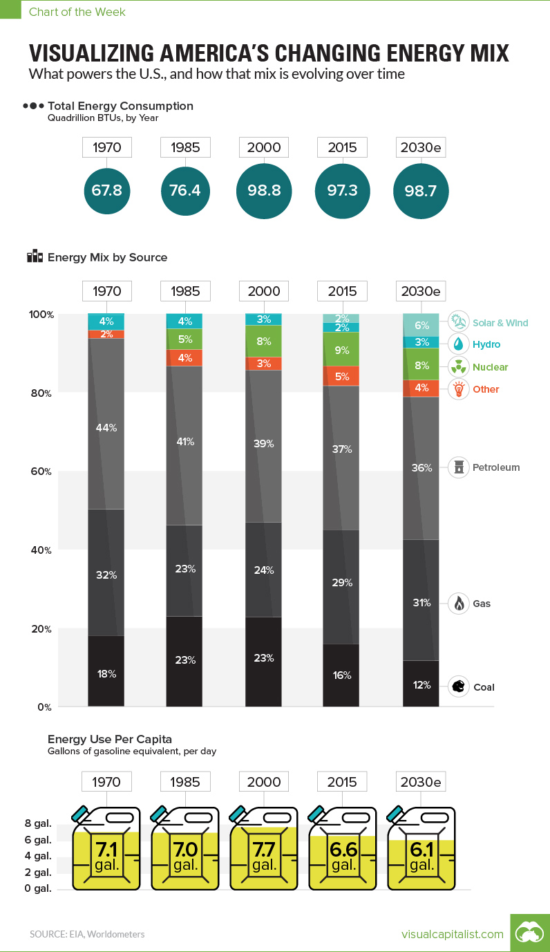
Today’s chart plots data from the Energy Information Administration (EIA) to show America’s changing energy mix, along with their projected mix for 2030.
It shows the total amount of energy used each year, along with energy use per capita. It then breaks down each year’s energy supply by source, which provides another way for us to visualize the decline of coal use, the resurgence in natural gas, and the rise of renewable energy.
Energy use per capita is measured in “gallons of gasoline equivalent per day”, which we thought was easy to relate to. (For our metric friends, a U.S. gallon is just less than four litres.)
Here’s the data:
| Year | Energy used (Quadrillion BTUs) | U.S. Population (millions) | Gallons of gas eq. (per day) |
|---|---|---|---|
| 1970 | 67.8 | 209.5 | 7.1 |
| 1985 | 76.4 | 240.7 | 7.0 |
| 2000 | 98.8 | 282.9 | 7.7 |
| 2015 | 97.3 | 321.8 | 6.6 |
| 2030e | 98.7 | 355.8 | 6.1 |
Here’s energy supply by source from 1970-2030. Projected data from 2030 is from the EIA as well.
| Year | Coal | Gas | Petroleum | Nuclear | Hydro | Solar | Wind | Other |
|---|---|---|---|---|---|---|---|---|
| 1970 | 18.1% | 32.1% | 43.5% | 0.4% | 3.9% | 0.0% | 0.0% | 2.0% |
| 1985 | 22.9% | 23.2% | 40.5% | 5.3% | 3.9% | 0.0% | 0.0% | 4.2% |
| 2000 | 22.8% | 24.1% | 38.7% | 8.0% | 2.8% | 0.1% | 0.1% | 3.4% |
| 2015 | 16.0% | 29.0% | 36.6% | 8.6% | 2.4% | 0.4% | 1.8% | 5.3% |
| 2030e | 11.7% | 30.8% | 36.3% | 8.1% | 3.0% | 1.1% | 4.7% | 4.3% |
Interestingly, solar and wind only make up about 2% of energy today according to the EIA, and they are projected to combine for 6% by 2030.
Various organizations have criticized these numbers, suggesting that the EIA is not properly accounting for green energy in America – and that it actually supplies a much bigger part of the energy mix.


