

We round up the most popular, most discussed, and most liked visualizations of the month on Voronoi, our new data storytelling platform. Read more
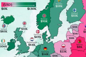
Which European economies are richest on a GDP per capita basis? This map shows the results for 44 countries across the continent. Read more
Examining how people get around using cars, public transit, and walking or biking, and the regional differences in usage. Read more
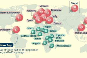
The median age is a single indicator of the age distribution of a population, useful for policy planning for the world’s oldest and youngest countries. Read more
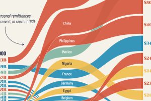
The top 10 countries by money received from abroad have seen a major shift through the years. Only three have stayed put. Read more

Doctor density is measured by the number of doctors per 10,000 people. A higher number indicates a more robust health network in the country. Read more
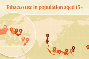
Since the 1950s, many countries have tried to discourage tobacco use and bring down smoking rates. Here’s where they haven’t worked. Read more
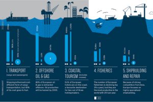
This infographic focuses on Europe, where the United Kingdom is nautical miles ahead of anyone else in terms of developing sea-related industries. Read more
Looking back on 2014, this infographic sums up the major changes occurring in energy markets in oil, renewables, sanctions, and more. Read more

How did the European Debt Crisis begin? This video explains how countries in the Eurozone built up such troublesome debt. Read more