

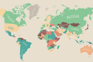
60,000 people in 180 different countries were asked by the OECD Better Life Index what was most important to them, and the data is presented in this infographic. Read more
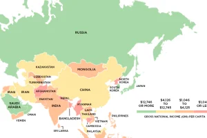
This series of maps uses data on Gross National Income (GNI) to classify the world’s richest and poorest countries based on four income groups. Read more
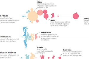
The World Risk Index ranks 171 countries by the risk of natural disaster. Here’s the riskiest places to live in the world. Read more
There is no shortage of sights to see in this world. See which countries rake in the most tourist dollars with this infographic map. Read more
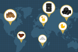
Every “thing” comes from somewhere. Whether we are talking about an iPhone or a battery, even the most complex technological device is made up of the raw materials that originate… Read more
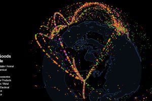
Use this interactive map to explore fascinating data on international trade. Which countries trade with each other, and which are stuck as hermits? Read more
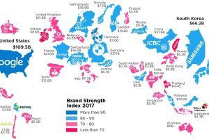
What is a top brand worth? This infographic highlights the most valuable brand in each country, according to the 2017 Brand Finance report. Read more
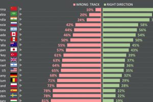
Do citizens think that their countries are heading in the right direction – or are they going down the wrong path? See survey results for 25 countries. Read more
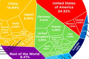
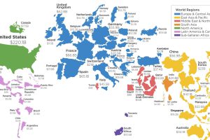
See how the multi-trillion dollar pie of the global economy gets divided between countries, based on the latest data from the World Bank from February 2017. Read more
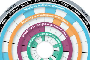
While they all have high expectations for economic growth, the risks facing emerging markets are very different. This visualization breaks it all down. Read more