At Visual Capitalist we’re on a mission to make the world’s information more accessible.
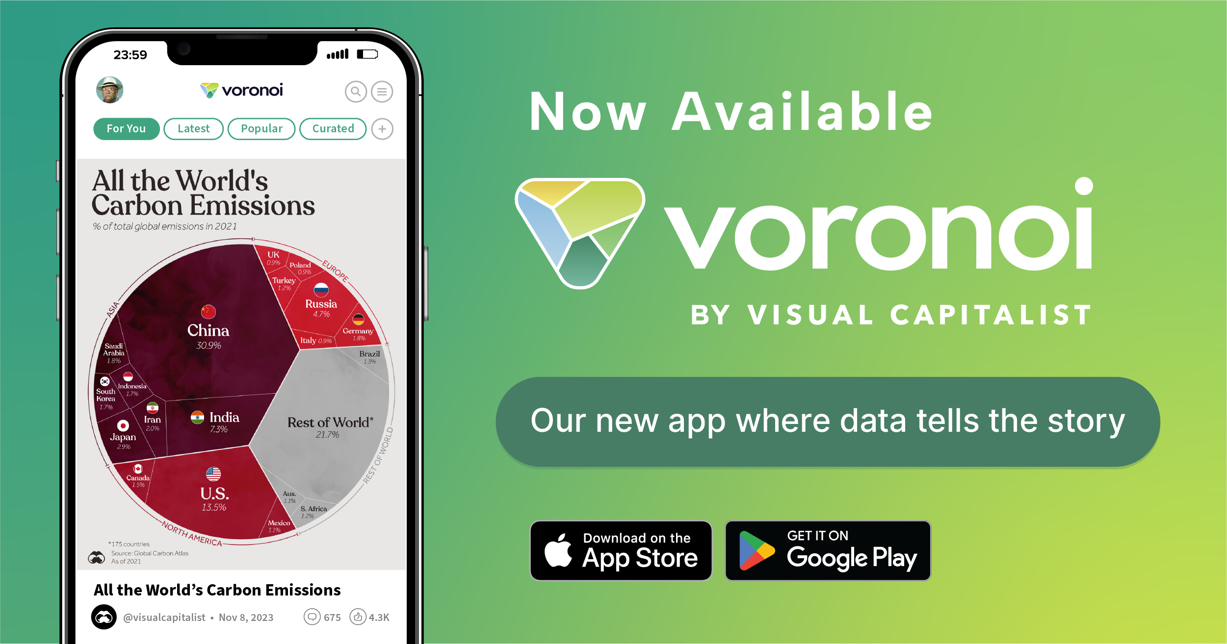
Our new app Voronoi is the next step on that journey, enabling people around the world to instantly discover new data and insightful visualizations.
We’re excited to announce that starting today, Voronoi is available to the public to download for both iOS and Android platforms.
Voronoi is the app we’ve been wanting to build for a long time. Not only will you find all of Visual Capitalist’s charts, infographics, and maps on Voronoi, but it’ll also enable you to discover new visuals from other world-class data creators as well.
In fact, if you log onto the app now, you’ll already see hundreds of incredible visuals in your feed. And every single data visualization posted is accompanied with the trustworthy, transparent, and well-sourced data behind it, which you can review with one click.
Our vision is that Voronoi will become the go-to place to discover new data and insights about the world, and we have an exciting pipeline of new features and content that we’ll be adding to the app over the coming months.
We hope you’ll check it out, and let us know what you think!
What’s Different About Voronoi?
Voronoi is the place where the world’s most curious people make, discover, and share data-driven stories that explain the world. It’s a platform that’s purpose-built for data visualizations and the exceptional creators that produce them.
Importantly, all data and sources are transparent and viewable on the platform. They are also vetted by the community and the Visual Capitalist editorial team to ensure that what you are seeing is trustworthy and reputable.
In the future, you’ll be able to create custom feeds to discover data uniquely suited to you, or even export a visualization and its backing data with one click.
Why Is It Called Voronoi?
Voronoi (pronounced vo-roh-noy) is a type of data visualization named after mathematician Georgy Voronoy.
It’s also one we’ve adapted at Visual Capitalist to make some of our most successful visuals like The World’s Population at 8 Billion or The $105 Trillion World Economy in One Chart.
It’s a tribute to the science and art of data storytelling.


