This Simple Visualization Compares the Economies of Every U.S. State
Over the previous month, we’ve published simple Voronoi diagrams that visualize the economies of the world as well as $60 trillion of global debt.
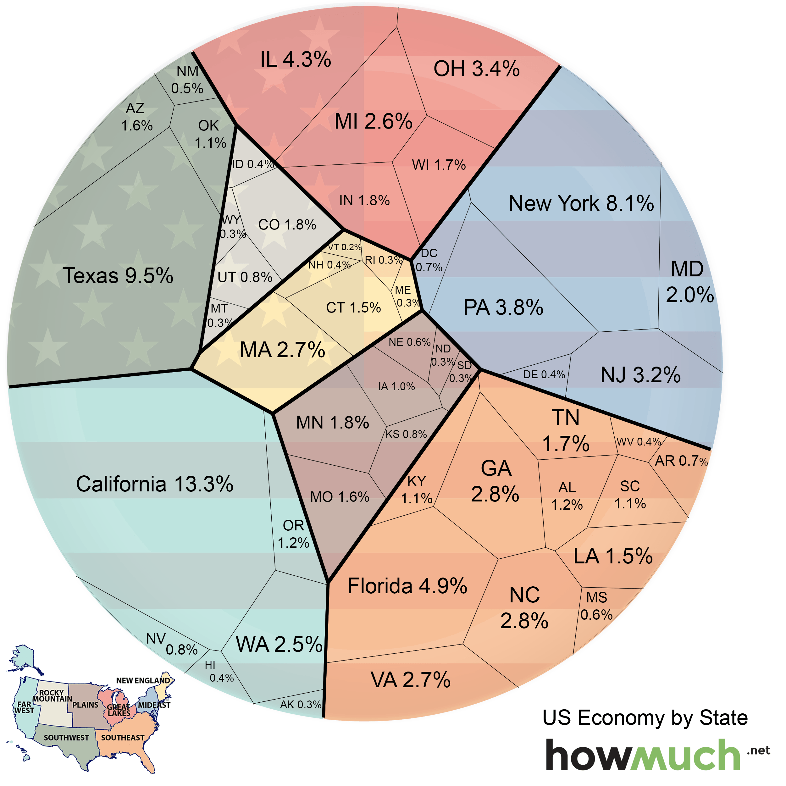
This visualization today compares state economies by contribution to America’s GDP of $17.3 trillion (2014), while also grouping the states by geographical regions such as New England, Mideast, Great Lakes, Plains, Rocky Mountains, Far West, Southwest, and Southeast.
Most economic activity is concentrated in three regions: Far West (18.6%), Southeast (21.3%), and Mideast (18.2%). The states in these regions, which cover the majority of the coastline where most big cities are located, comprise nearly 60% of the U.S. total economic output. Compare this with sparsely populated regions such the Rocky Mountains, which contributes only 3.6% of economic output between five large states.
The largest individual state economies include California (13.3%), Texas (9.5%), and New York (8.1%). The smallest economy is held by Vermont (0.2%) with seven others contributing 0.3% of economic output: Maine, Rhode Island, North Dakota, South Dakota, Montana, Wyoming, and Alaska.
How has the relationship between state economies changed over time? The publishers at HowMuch.net note:
“All states have increased their economic outputs between 2011 and 2014, but some have grown faster than others. In terms of regional influence, the Southeast economy has shrunk in relation to other regions by just 0.4% over the last four years, while the Southwest economy has grown by 0.8% relative to other regions. Texas increased the size of its economy by almost $300 billion, more than any other state, growing from 8.8% of the US economy in 2011 to 9.5% in 2014. This growth in Texas was fueled by mining and manufacturing. California grew by just under $300 billion, but only increased its share of the total economy by 0.1%.”
Original graphic by: HowMuch.net


