This Map Compares the Size of State Economies with Entire Countries
The United States is the world’s largest economy, but sometimes it’s easy to forget just how massive a $19 trillion economy actually is.
The only comparable economy in size would be China, but unfortunately the incredible scope of China’s economic boom is something that is also difficult for foreigners to wrap their heads around. We’ve tried to do this in the past by showing you the massive cities that no one knows about, ambitious megaprojects that are underway in the region, and the country’s staggering demand for commodities.
But still, comparing the U.S. to China can be overwhelming – and that’s why it can be more effective to show the U.S. economy as the sum of its parts.
States as Countries
Today’s infographic comes to us from the Carpe Diem blog done by Mark Perry at the American Enterprise Institute.
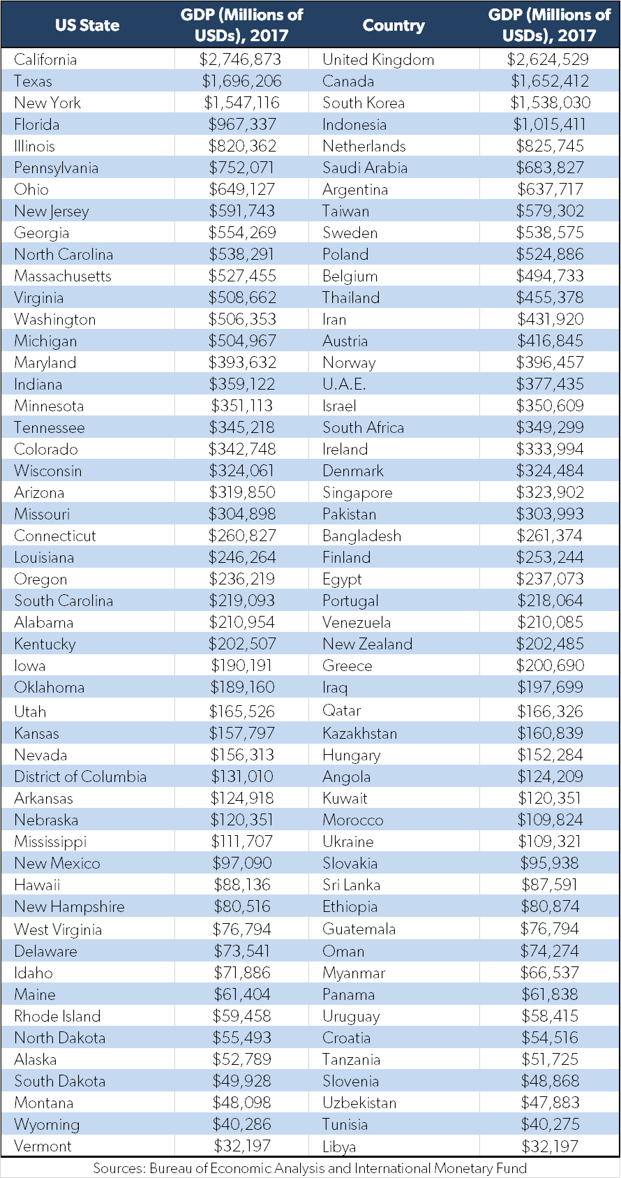
It matches the size of U.S. state economies, based on nominal GDP numbers, with comparable countries around the world. For example, the state of Texas ($1.7 trillion) is roughly the equivalent of Canada ($1.65 trillion), while Maine ($61.4 billion) is closer to Panama ($61.8 billion) in terms of economic output.
Here’s the full table – courtesy of Carpe Diem – on how each state breaks down:

Sum of the Parts
By looking at the United States in this unique way, we really get a better sense of the scale of the country’s economy as a whole.
Add together just the states of California, Texas, and New York, and you’ve got an economy the size of the United Kingdom, Canada, and South Korea put together. And with each additional state, you’re adding significant economies like Indonesia, Netherlands, Saudi Arabia, or Singapore to that mix.
Impressively, even the more sparsely populated states have country-sized economies. Montana compares to Uzbekistan, North Dakota is similar to Croatia, and so on.
If you’re interested in seeing other ways to visualize America’s economy, see a previous post using some other Carpe Diem maps here.


