Every once in a while, a data visualization trend organically sweeps through Reddit, the popular social news aggregation site, leading to some eye-catching and interesting user-generated results.
We’ve seen users visualize how they spend their disposable income, how they spend their time, and even details of their relationships. Sometimes these charts are fairly personal and uninteresting to the outside world – but other times, they can be quite compelling to a wider audience.
Population in Fourths
Most recently, in the Data is Beautiful subreddit, the trend has been to use data visualization techniques to split up the maps of countries into four evenly populated areas.
There are hundreds of maps to be found using this technique, but here are just five examples that we thought were particularly interesting. Each one reveals certain things about the population distribution, geography, and urban/rural split in their respective jurisdictions.
The United States
The first map is the least striking, but it creates an interesting baseline – it shows the U.S. divided into four equal sections of population, with no single area standing out as being incredibly dense or sparse:
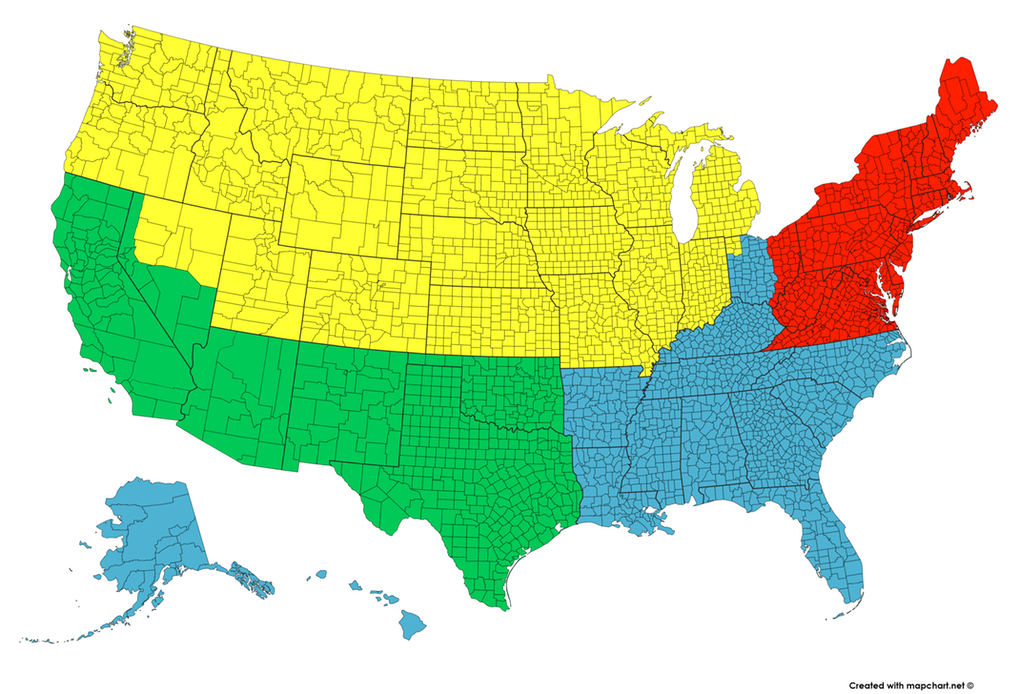
With over 300 million people spread throughout the country and big population centers in each region, it’s no surprise that this split into fourths is quite even.
However, that will not be the case for the remaining maps.
California
For example, when we go to the state level the distributions can be more easily impacted by big cities:
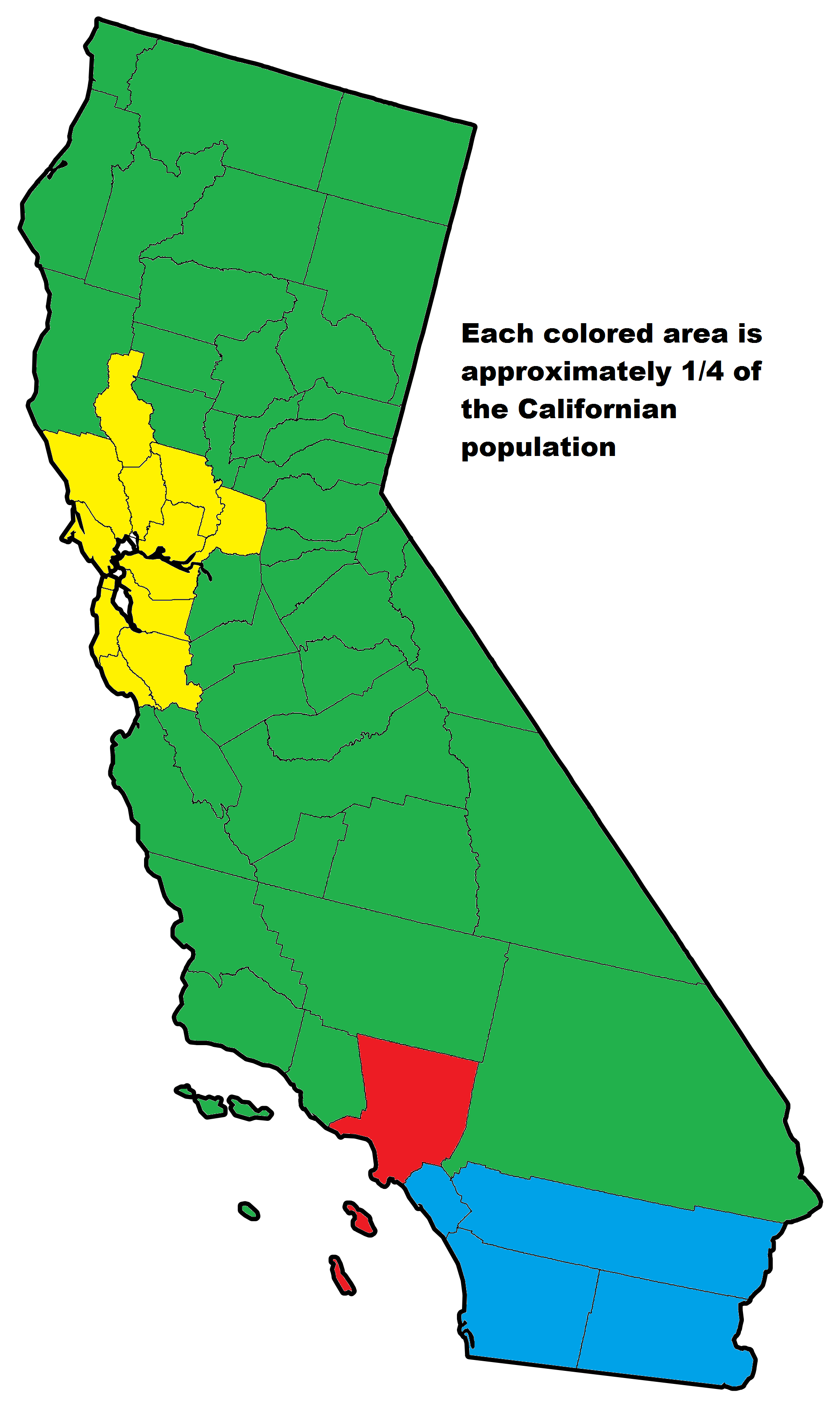
This map of California by old_gold_mountain is a great example of this – with three major urban areas (Los Angeles, Bay Area, and San Diego) all holding large amounts of the state’s population, the composition looks quite uneven when it gets divvied up in this way.
Canada
But Canada’s sparseness in the north goes to an even greater extreme:
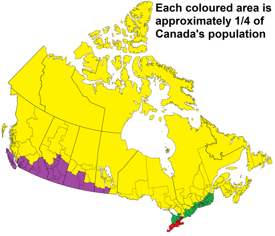
It’s said that 90% of the Canadian population lives within 100km of the U.S. border – and this map by repliers_beware makes it clear that any further north can get pretty remote.
Australia
Australia is another country with geographical diversity. Some regions are conducive to civilization and growing great wine, but few species (including humans) find the Outback very hospitable.
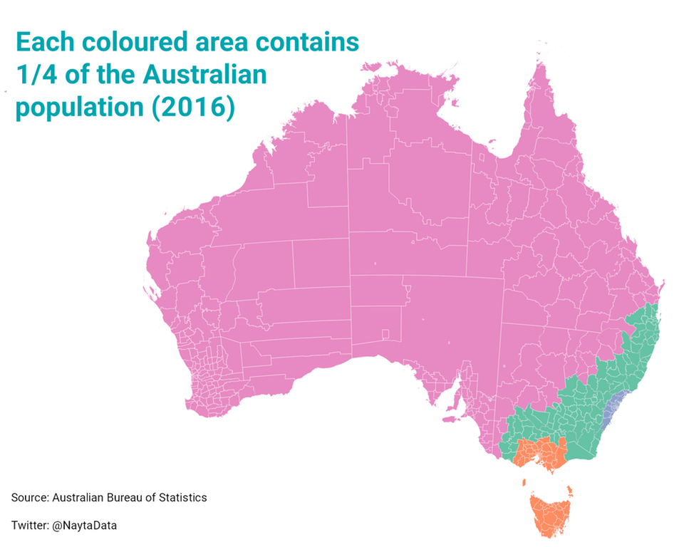
In this case, user NaytaData lumps in the Outback with cities like Adelaide and Perth to get this colored area up to the required 25% population mark.
Chile
For a very long and narrow finale, here is the country of Chile.

This map by QuietlyEcstatic shows that the capital Santiago and its surrounding area is roughly equal to three other very large sections of the country – including the sparse but beautiful Chilean piece of Patagonia.


