The World Map of Debt
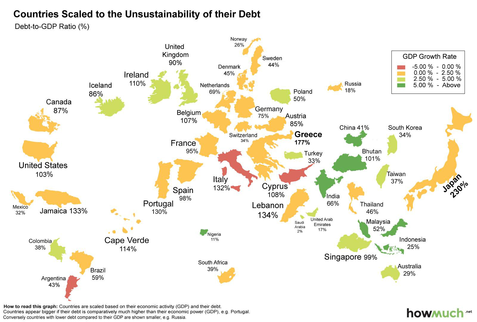
Every country is scaled based on its debt-to-gdp
What if we were to redraw the world map based on the sustainability of national debt levels?
Countries that are smaller in size, but that have big debt loads, would stand out more. If we used debt-to-GDP as scaling criteria, Japan would become the largest country on our new map. Japan holds 19.99% of all global debt despite only having about 6% of the world’s economic production. The country’s debt-to-GDP ratio is 230%.
Greece and Italy, two medium-sized European countries, would be bigger than North America as a whole. That said, the United States does hold an extreme amount of debt itself, equal to an astounding 29.05% of global debt. It is just masked more because of the country’s significant GDP. We have also looked at the United States another way in the past, and by the measure of debt-to-revenue, the US has the 2nd largest debt burden in the world.
On the opposite side of the question, there are large countries that have less debt – they disappear from the map almost completely. Australia, a giant land mass, is reduced to a tiny island with its load of 29% debt-to-GDP. Nigeria shrinks to a tiny speck on the map with an 11% ratio.
Original graphic by: HowMuch.net


