Some professionals scoff at the importance of branding in business.
For many investors and analysts, this area of marketing seems fluffy and intangible, which makes it very hard to measure any potential benefits. While it’s true that quantifying intangibles is not always easy or accurate, it doesn’t mean that branding has no value to begin with.
In this way, branding may be comparable to the concept of “leadership” in sports. Athletes like Mark Messier, Michael Jordan, Ray Lewis, Mia Hamm, and Steve Yzerman weren’t just good players from a technical perspective, but they also had intangible qualities that elevated the performances of their respective teams. While it is hard to measure work ethic, passion, leadership, drive, and loyalty, or how these qualities rub off on teammates, it’s still clear to many coaches and managers that intangibles help win championships.
Like leadership, we know good branding when we see it, even though it can be tough to quantify. Coca-Cola is recognizable and nostalgic, while the Starbucks name may be the difference in choosing their cafe over an average-looking coffee shop in an unfamiliar neighborhood.
The Psychology Behind Logo and Color Choice
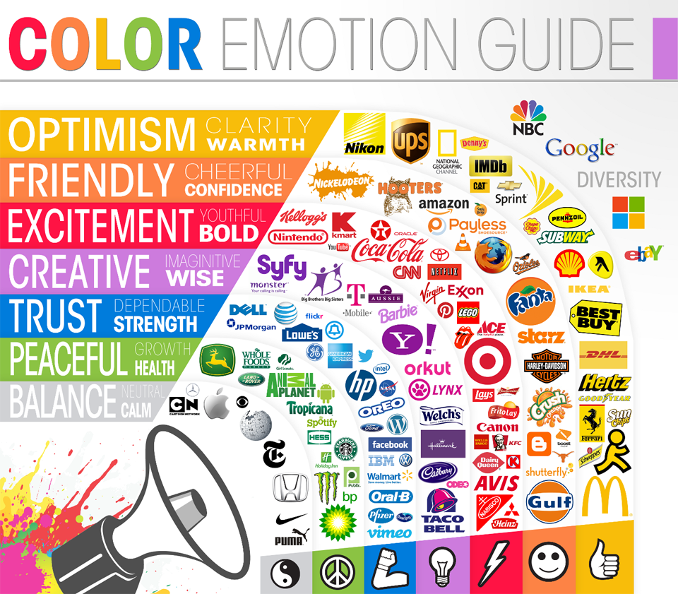
Logo and color choice are two of the most important parts of creating a quality brand. Today we have two infographics from The Logo Company. One shows the five major forms of logos, while the other dives into the meaning behind color choices.
We’ll add some commentary on the implications of logo and color choice in of the areas below.

Companies cannot control the actual emotional responses to their brand on a personal level, but they can do their best to control shape, style, and color to at least guide these interpretations.
In fact, our brains are hardwired to learn and memorize new shapes, so the way a logo is presented can have a big impact on its effectiveness. The five major types of logo forms – brand marks, word marks, letter marks, combo marks, or emblems – are a way to control shape and identity.
Word marks, for example, have the name of the company in the logo itself without any imagery. This helps achieve brand recognition, while the lack of accompanying graphics may convey a sense of sophistication to consumers.
Using just initials in a letter mark can show even more sophistication. Leading luxury consumer brands such as Louis Vuitton or Chanel have used this with much success.
On the opposite end of the spectrum, some companies use just a brand mark to convey a sense of universality. Even though “Shell”, “Apple”, and “Nike” are not spelled out in name, their famous icons are known throughout the world. The Nike swoosh conveys movement, while the World Wildlife Fund can tell a powerful story just by using the famous panda in its brand mark.
Target is another instantly recognizable brand mark. The simplicity and circular shape are key elements to the design, but the bright red color also plays a role. Here’s a guide to how color can evoke different emotions in consumers:

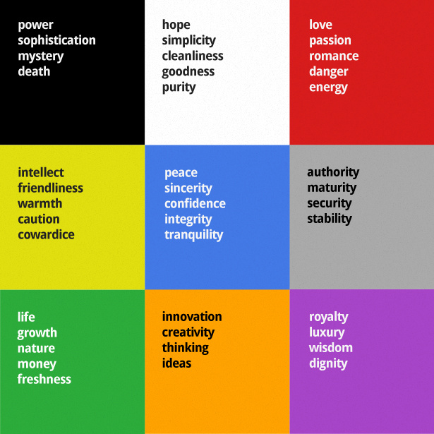
One step further, here is another version with a little more nuance, from Web Designer Depot.

Of course, colors can and do get interpreted in different ways. However, they can also have the power to represent broad ideas for cultural or evolutionary reasons.
In a previous post on the psychology of color, we dive into this in more depth. For example, it explains why the color red stimulates appetite, or why blue brings a sense of productivity and efficiency.


