The beautiful thing about data visualization is that it can appear deceptively simple.
The world is infinitely complex and burgeoning with all kinds of information. As a result, it seems counterintuitive that things can be reduced to a basic bubble chart or a graph – and to be fair, most things can’t.
When the opportunity does arise, however, the results can be very compelling and thought-provoking. A distilled story can help create insight around a subject that wasn’t possible when looking at it with more nuance and complexity.
The Population of Every Country in Bubbles
Today’s visualization comes from Datashown, and it helps to give some perspective on world population.
It’s a deceptively simple visualization, but the story that gets distilled is loud and clear:
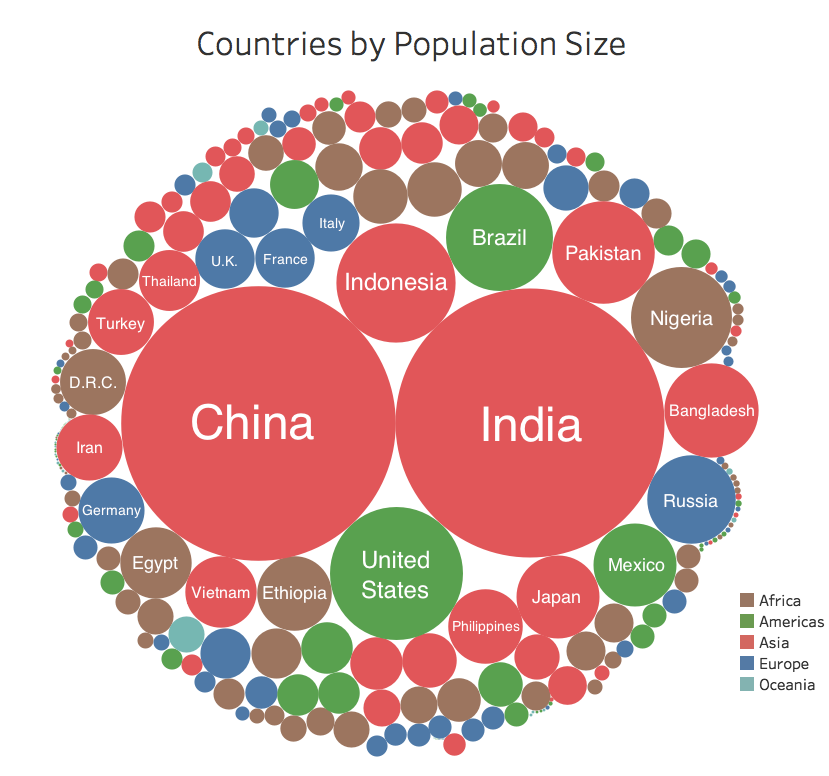
The beauty lies in the simplicity – and although all countries are represented, only the labels of the biggest are shown.
If you want to dive into the granular data, here is an interactive version of the same diagram, with all countries and population statistics embedded.
Zooming in on the United States
On the above bubble chart, envision “zooming in” on the circle representing the United States, which is located just below China and India.
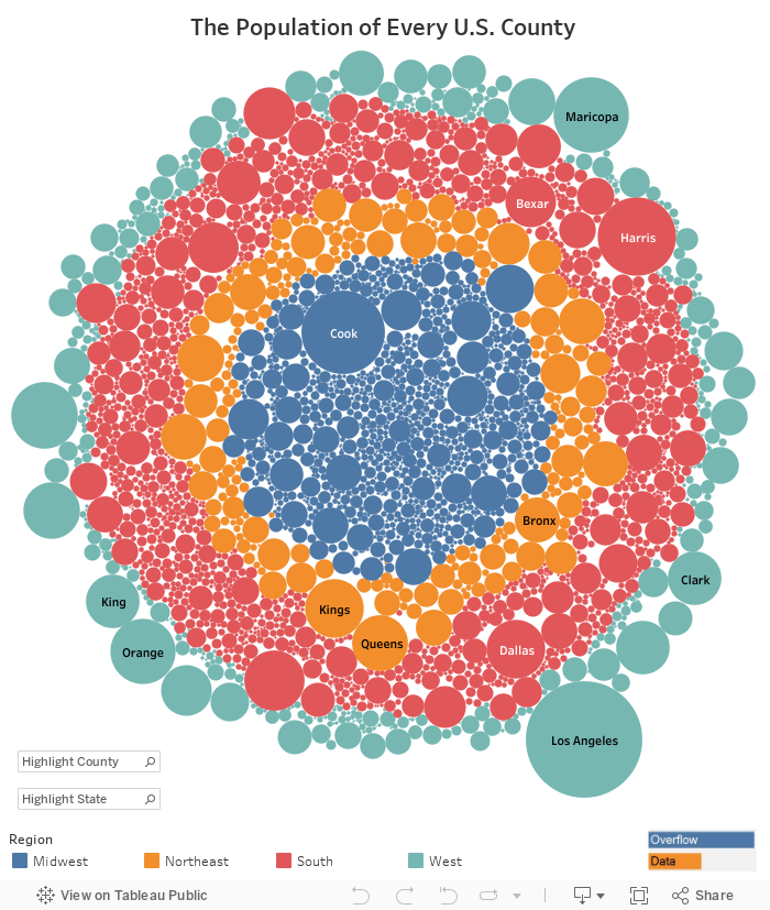
Here’s the population of every U.S. county in interactive form, from Overflow Data. Highlight any circle (or use the search function) to find the information on a particular county:
var divElement = document.getElementById(‘viz1490808585141’); var vizElement = divElement.getElementsByTagName(‘object’)[0]; if ( divElement.offsetWidth > 800 ) { vizElement.style.width=’704px’;vizElement.style.height=’869px’;} else if ( divElement.offsetWidth > 500 ) { vizElement.style.width=’704px’;vizElement.style.height=’869px’;} else { vizElement.style.width=’100%’;vizElement.style.height=’734px’;} var scriptElement = document.createElement(‘script’); scriptElement.src = ‘https://public.tableau.com/javascripts/api/viz_v1.js’; vizElement.parentNode.insertBefore(scriptElement, vizElement);
Feeling small yet?


