The Historical Returns by Asset Class Over the Last Decade
Recently, we’ve looked at different crisis events through history, and the returns by asset classes for each period of time.
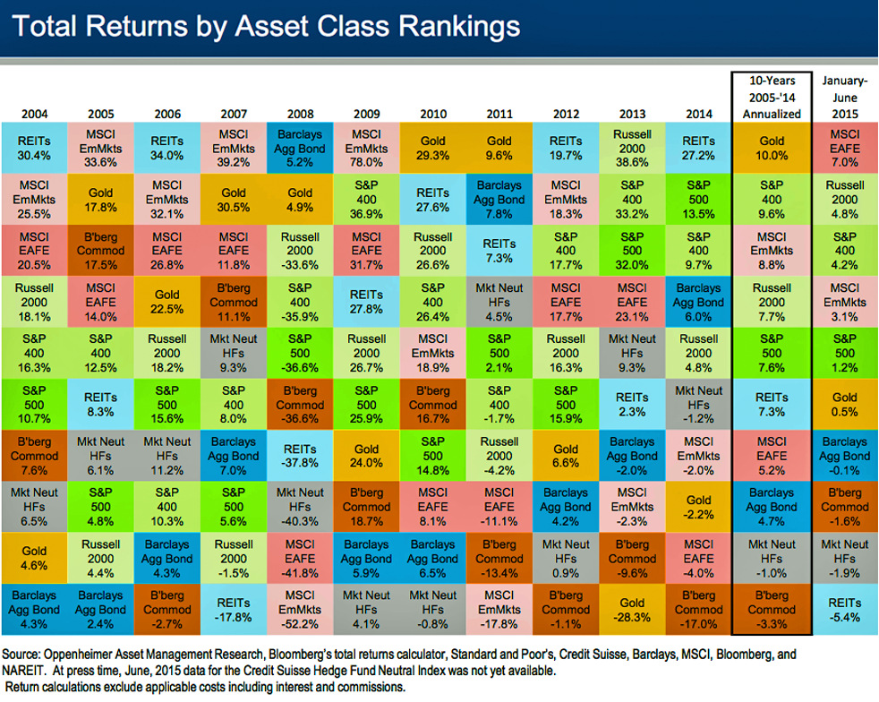
Today’s chart is more general and breaks down performance over the last decade. It’s sorted by different baskets of assets such as bonds, commodities, gold, stocks, real estate, and emerging markets. Note that the chart uses indices that serve as a proxy for specific asset classes. For example, the Bloomberg Commodities Index acts as a broad representation of the performance of all commodities in different sectors. Scroll to the bottom of this post to see a legend that gives a description for each item on the chart.
There are a few lessons worth noting here. First, despite gold having a difficult last few years, it is actually the best performing asset class over the last decade, returning 10.0% annualized. Gold was also the #1 or #2 performer for five of seven years straight between 2005 and 2011. It just goes to show the intensity of bull and bear markets in the metal, and reinforces the fact that it takes multiple years to cool down that momentum before the next upswing may start.
Next, the importance of diversification is almost self-evident. Stocks in emerging markets, for example, just crush other assets in the good years. In the bad years, they are the worst performing assets on the chart. Imagine having a portfolio of just stocks in emerging markets, and you have a financial roller coaster that would make any investor queasy.
Lastly, outside of highly-leveraged Wall Street traders, most investors consider bonds to be quite boring. In the last decade, returns of the Barclays Aggregate Bond Index have ranged between -2.0% and 7.8%. Bonds are typically considered a relatively consistent and less volatile asset class, which help create a baseline for a portfolio. However, on this chart, bonds are all over the map because it is the other investments that are swinging with volatility. In the 2008 crisis, bonds were actually the best performing class with a 5.2% return.
To be fair, there is much speculation of a bond bubble lately, so bonds may not be boring for long.
Returns by asset class chart legend:
- REITs: Real estate investment trusts, a proxy for property and real estate.
- MSCI EmMkts: Index tracking 838 companies in 23 emerging markets countries.
- MSCI EAFE: Measures performance in Europe, Australasia, and Far East. Essentially a barometer for equity performance outside of the US and Canada.
- Russell 2000: Index tracking 2000 smallcap equities in the United States.
- S&P 400: The S&P Midcap 400 is a benchmark for midcap companies in the United States.
- S&P 500: The S&P 500, one of the most commonly followed indices, covers a diverse set of 500 large companies with common stock on the NYSE and NASDAQ exchanges in the US.
- B’berg Commod: A broadly diversified commodity index tracking the futures of 22 different commodity markets in seven sectors.
- Mkt Neut HFs: Market-neutral hedge funds seek to avoid forms of market risk by hedging.
- Gold: The price of gold.
- Barclays Agg Bond: Broad base index includes treasury securities, government agency bonds, mortgage-backed bonds, corporate bonds, and a small amount of foreign bonds traded in the US.
Original graphic by: Business Insider


