The Collapse of Commodities in One Simple Chart
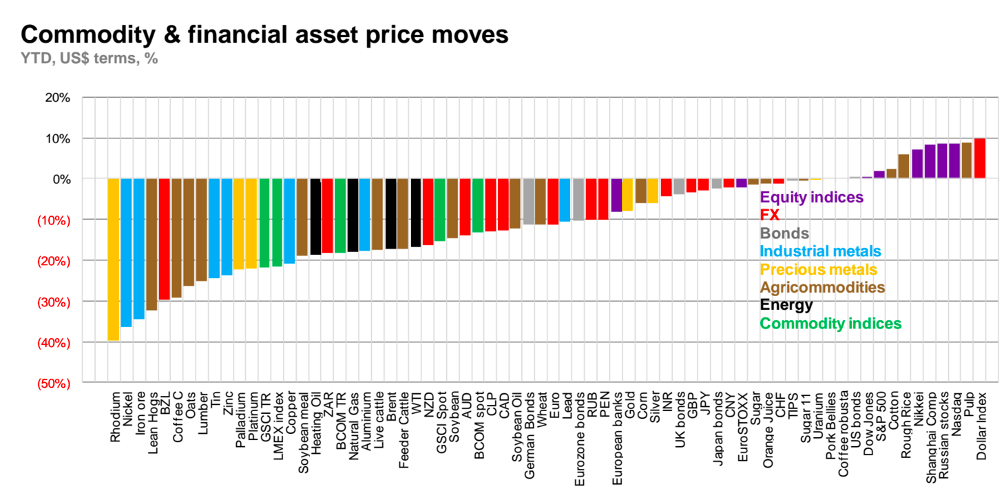
This chart from Macquarie puts the year in perspective for commodity investors. It covers various asset classes including equities, FX markets, bonds, and commodity prices, and charts them YTD in terms of US dollars and expressed as a percentage.
For a simple chart, there is a lot of information here to consider.
For starters, on the far right is the prime culprit in stymying commodity markets: the Dollar Index. The US dollar, which commodities are priced in, has had a big year with close to a 10% return YTD. While the US economy is still suspect at best, it has served as a safe haven for investors this year over markets such as Europe, China, and Japan. As a result, the USD has had the best performance of all of these asset classes listed on the chart.
The other market on the right worth noting is the Nasdaq, home to many of the tech stocks that have kept the US economy chugging along. While some are skeptical of the true value of some of the companies in Silicon Valley, it cannot be denied that the Googles, Facebooks, and Amazons of the world are the key to keeping US growth intact in any capacity.
To the left of the zero mark, things get dire fast.
Precious metals such as gold and silver are down, but this can be mostly attributed to the strength of the dollar. Energy and industrial metals, on the other hand, have been thoroughly routed due to a combination of dollar strength and slowing Chinese growth. Many agricommodities have struggled as well.
The biggest losers of the bunch include rhodium, nickel, iron ore, and lean hogs, all which are down more than 30% YTD.


