In December 2023, we publicly launched Voronoi, our free new data discovery app!
The initial response from both users and creators has been amazing. We now have millions of in-app views, and there are already more than 2,000 interesting visualizations to discover, many of which will never be published on Visual Capitalist.
For that reason, we’ve chosen to highlight some of the most popular visualizations and creators from September in this roundup. To see them and many others, make sure to download the app!
Let’s take a look at a popular creator worth highlighting, a top “Editor’s Pick” of the month, and also the most popular and most commented on visuals.
POPULAR CREATOR
Perrin Remonté
Visual Capitalist is just one of many creators on Voronoi.
In fact, the data storytelling platform has many world-class creators with insightful visualizations, such as cartographer Perrin Remonté.
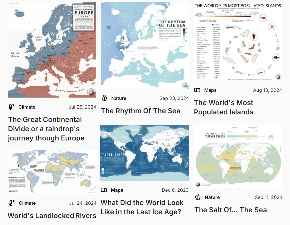
Here are just some of the data-driven maps submitted by Perrin Remonté over recent months:
- The world’s most populous islands
- Europe’s drainage of river systems into oceans and seas
- What the world looked like during the last Ice Age
- The world’s landlocked rivers
Make sure to follow Perrin on Voronoi today to see many great maps in the future!
 View all visuals from Perrin on Voronoi today.
EDITOR’S PICK
Forest Fire Damage Over the Last 20 Years
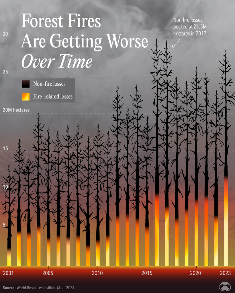
One of the recent picks in our Editor’s Pick feed on the app is from Visual Capitalist, and it creatively shows forest fire damage over the last two decades.
This unique and captivating execution shows two important pieces of data: (1) the amount of total forest loss in a given year, and (2) what portion of that came from global wildfires.
It’s a great case study on how to make an impact with what could have been a simple bar chart.
 Get the data behind this visual on Voronoi today.
MOST DISCUSSED
Putting Germany’s Economy in Perspective
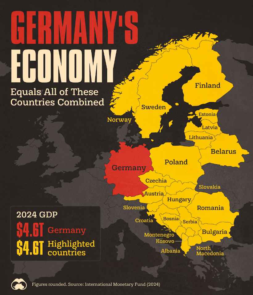
How big is Germany’s economy, exactly?
The country’s GDP is about $4.6 trillion, or to look at it another way…
This visualization by Visual Capitalist was the most commented on visualization on Voronoi in September.
Rightfully so, users pointed out that if some of the nations shown had more comparable populations to Germany, that their economies would then be much closer in size. Others noted that regardless, it’s still impressive in absolute terms that one country can have a similar economic output to 22 nearby countries.
 Get the data behind this visual on Voronoi today.
MOST VIEWED
Lexus is the Most Reliable Car Brand
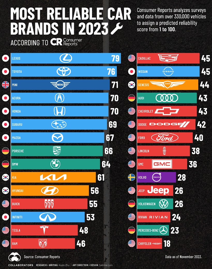
Which car brand is the least likely to cause you problems down the line?
In the following chart, Visual Capitalist uses data from Consumer Reports to break down the most reliable cars:
Consumer Reports used results from over 330,000 vehicles and sorted issues into 20 common problem areas.
The result? Lexus and Toyota come out on top, with Mini being the top non-Asian brand. U.S. brands generally lagged behind, with Chrysler being the least reliable brand in the mix.
 To join the conversation, join Voronoi today.


