

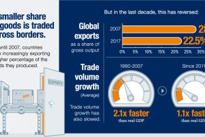
Evidence is growing that the nature of globalization is changing dramatically – and the countries, companies, and workers that benefit are changing as well. Read more
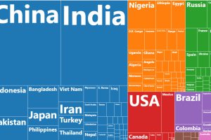
This chart resizes the world’s countries based on population, while organizing them based on region. See where all 7.5 billion people live. Read more
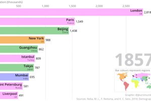
This two-minute animation shows changes in the last 500 years of historical rankings for the world’s 10 most populous cities. Read more
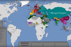
This epic attempt to condense the history of the world — including the rise and fall of empires — fits into a single video. Read more

There is $360.6 trillion of wealth globally. This graphic shows how it breaks down by country, to show who owns all of the world’s wealth. Read more
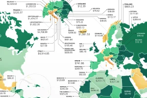
These maps show the most (and least) costly countries for starting a business by relative costs. Read more
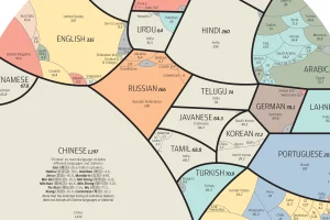
See the world’s major languages broken down by country in this stunning visualization. Read more
Conventional cartographic techniques have caused many to have a skewed perception of the true size of countries. Can an equal-area map provide clarity? Read more
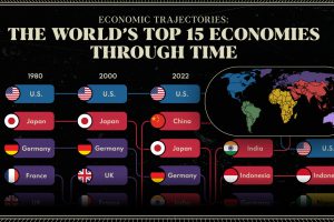
We provide a historical and predictive overview of the top economies in the world, including projections all the way to 2075. Read more