

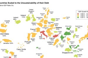
What if the world was remapped based on national debt levels? What would the largest country be? See the world map of debt. Read more
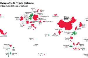
The U.S. has run a trade deficit for 40 years now. Where does that net foreign spending go? This map visualizes the data from 2015. Read more
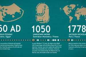
What did ancient maps look like, before we had access to airplanes and satellites? See the evolution of the world map in this nifty infographic. Read more
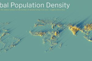
What does population density look like on a global scale? These detailed 3D renders illustrate our biggest urban areas and highlight population trends. Read more
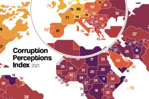
Which countries are the most (and least) corrupt? This map shows corruption around the world, and the movers and shakers over the last decade. Read more