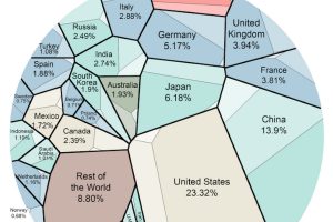
This data visualization is the most simple breakdown we have seen that shows the composition of the world economy. Read more
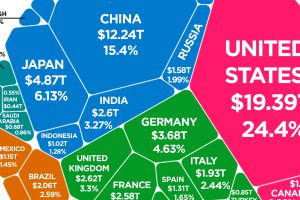
Latest estimates put the world economy at about $80 trillion in nominal GDP. Here is how each individual country stacks up in terms of size. Read more
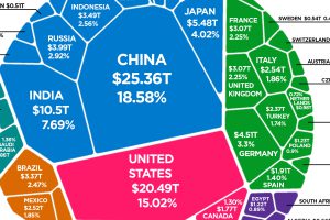
After adjusting GDP for purchasing power parity (PPP), here is how the composition of the world economy breaks down by country. Read more
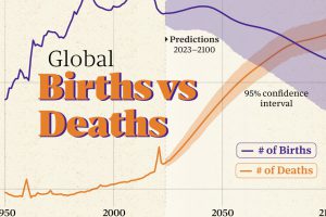
A global population inflection point is closer than we think. The latest UN estimates say 2084 could be a crucial year. Read more
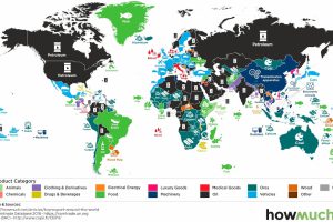
What is the top export in every country? This series of maps explores some of the most influential goods in global trade. Read more
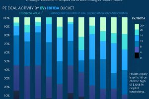
The last decade has witnessed an avalanche of investor capital gravitating towards private equity, along with much richer deal valuations. Read more
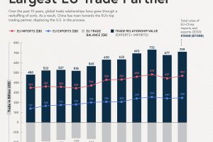
China has spearheaded its economy towards a global superpower, and as a result, has overtaken the U.S. as the EUs top trade partner Read more
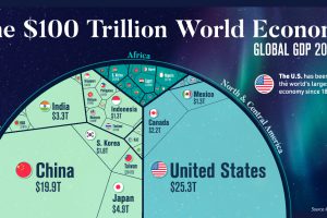
Despite ripple effects from conflict and inflation, global growth continues. According to the IMF, the global GDP will hit $104 trillion by end of year. Read more
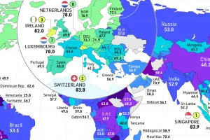
How free are people to control their own labor, property, and finances? This map reveals the state of economic freedom globally. Read more
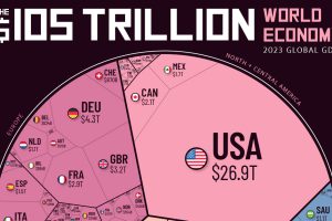
How much does each country contribute to the $105 trillion world economy in 2023, and what nations are seeing their nominal GDPs shrink? Read more

