

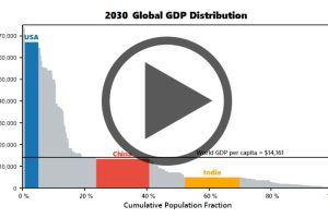
Watch the economies of the United States, China, and India evolve before your eyes from 1970 until 2030 (projected). Read more
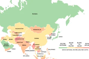
This series of maps uses data on Gross National Income (GNI) to classify the world’s richest and poorest countries based on four income groups. Read more

This stunning data visualization breaks down the top 50 wealthiest billionaires by industry, age, country, as well as the size of their fortunes. Read more

This graphic shows median income by state in 2024, adjusted for cost of living. Can you guess where it’s the highest? Read more
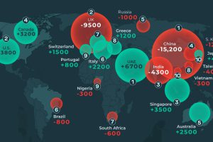
This graphic shows the countries expected to see the highest millionaire migration in 2024, both in terms of net inflows and net outflows. Read more
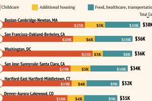
Raising a child in a large U.S. metro costs an average of $25k per year. Read more

This graphic illustrates the distribution of wealth in the United States from 1990 to 2023 by generation, from Millennials to Boomers. Read more

In this graphic, we show the wealthiest cities in the world based on the number of millionaires and billionaires in each metropolitan area. Read more

The U.S. has more millionaires than Ireland has people. Here’s a list of other countries with the most millionaires. Read more
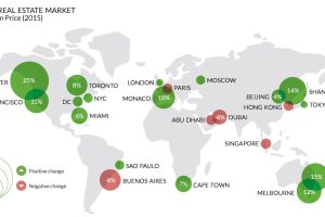
Which world-class cities are the ultra-rich flocking to? Which are they avoiding? The lopsided market for luxury properties helps tell the tale. Read more