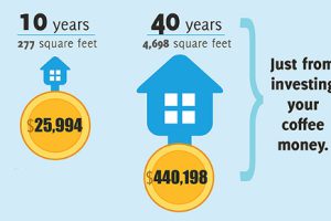
The difference between good and great is found in the details. As discussed in this infographic, a few little investing ideas can make a big difference. Read more

The richest counties in America by median income are not located near Silicon Valley or adjacent to Wall Street. They are not in oil rich Texas either. Read more
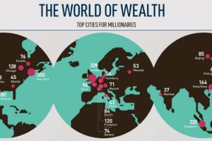
This infographic breaks down the top cities for millionaires sorted by density and total population, as well as providing demographics. Read more
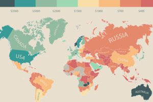
In this infographic, monthly disposable income around the world is mapped by state and country. Switzerland leads the pack with $6,301 in income per month. Read more

Who are the world’s wealthiest people in 2015? This infographic shows the trends as well as the top 10 billionaires, and how they amassed their fortunes. Read more
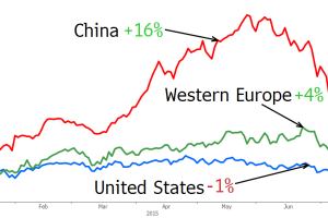
China’s stock market is a roller coaster, creating and destroying trillions of wealth in the matter of months. See how China’s ultra rich fared in the last month. Read more
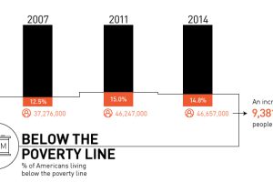
Is there really a recovery? Most recent data shows that there are 9.4 million more Americans in poverty than 2007, with growing inequality. Read more

With China’s slowing growth, and India lost in a maze of bureaucracy, who can we rely on as the emerging markets of the future? Read more
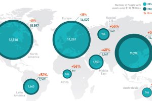
In the old days, speculators would follow the gold rushes. Now, it’s emerging markets that provide the big chance to become the next centimillionaire. Read more
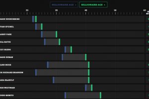
Is it the first million or billion that is the hardest? See how long it took these entrepreneurs to go from millionaire to billionaire. Read more

