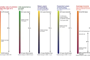
This visualization shows the global inequality gap — a difference in the standards of living around the world, as well as how it’s changed over 200 years. Read more
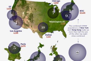
Where do the world’s ultra-wealthy people live? Here are the top 10 cities, by number of ultra-high net worth individuals. Read more
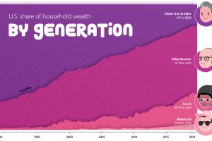
How large is the wealth gap between Millennials, Gen X, and Baby Boomers? We visualize the growing wealth disparity by generation and age. Read more
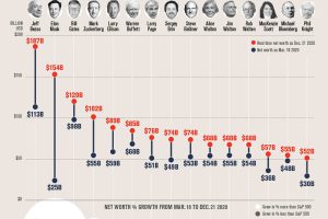
The net worth of some American Billionaires has grown substantially since the COVID-19 market bottom. Here’s how much their fortunes grew. Read more
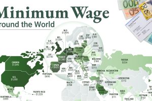
This infographic shows the net minimum wage across 67 countries, as of January 2023. A breakdown by U.S. state is also included. Read more
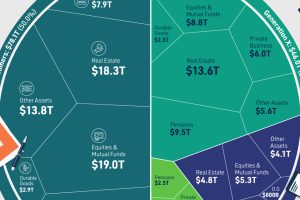
We’ve visualized data from the Federal Reserve to provide a comprehensive break down of U.S. assets by generation. Read more
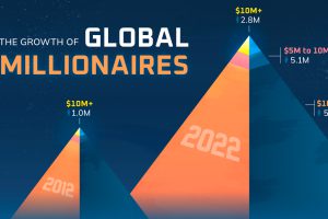
The world’s millionaire population has more than doubled in the last decade between 2012 and 2022. We visualize these numbers here. Read more


