

A data-driven snapshot of global wealth distribution. The average person around the world is doing better, but big-picture inequality is still staggering. Read more
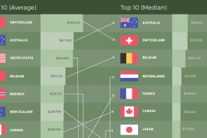
How do the rankings of the world’s most affluent countries change when using different metrics to measure wealth per capita? Read more
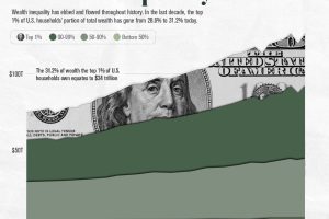
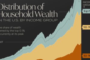
Over the past decade, the top 1% of U.S. households’ portion of wealth has gone from 28.6% to 31.2%. Read more
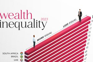
In the world’s most unequal country, the richest 10% control 80% of the wealth. In this graphic, we compare wealth inequality worldwide. Read more
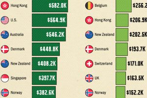
In this graphic, we show wealth per person by country, highlighting the richest nations in the world across average and median wealth. Read more
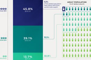
Global wealth at the end of 2020 was about $418 trillion. Here’s a breakdown of the global wealth distribution among the adult population. Read more
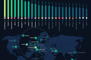
Analyzing 2023 per capita GDP numbers from the International Monetary Fund lets us know where the richest countries in the world are. Read more
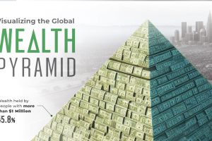
Global wealth stands at over $454 trillion. This graphic shows how it’s distributed, by various levels of net worth. Read more
Wealth distribution in America is becoming increasingly unequal, with the wealth held by the top 0.1% reaching its highest level on record. Read more