
In this list, we count down the 14 best Visual Capitalist infographics of 2014. Read more

Put down your turkey leftovers – it’s time to recap Visual Capitalist’s top 15 infographics, data visualizations, and charts of 2015. Read more
We roundup the best infographics, charts, and data visualizations that were posted over the year. Don’t miss Visual Capitalist’s Top Infographics of 2016! Read more
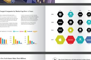
Two example spreads from Visual Capitalist’s new book ‘Visualizing Change’. Over 12 pages of infographics to sample here, as they would appear in the book. Read more
We count down our favorite infographics and charts from the year, including many you may not have seen before. Catch some of our best work in this Top 17 list. Read more

A countdown of our top infographics from the last year, including some of our most viewed graphics as well as other hand-picked entries from our staff. Read more
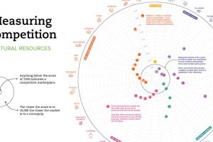
Which resource markets have healthy levels of competition, and which are more monopolistic? This chart shows the global level of competition for 33 minerals. Read more

Here’s a sneak preview of features that VC+ members will get in their inbox in January 2020. Read more

Use the powerful infographics, charts, and data visualizations created by Visual Capitalist to anchor your next story, publication, or report. Read more


