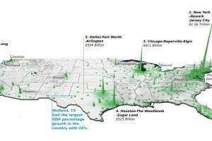
Did you know that the Top 20 metropolitan areas in the U.S. contribute 52% of the total country’s GDP? See how it breaks down by city in this 3d map. Read more

In June 2022, the U.S. Supreme Court overturned Roe v. Wade, opening the door for states to make their own decisions regarding abortion legality. How did states react? Read more
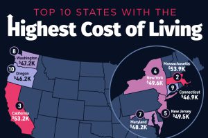
Hawaii secured the top spot as the U.S. state with the highest cost of living, with an average annual expenditure of $55,491. Read more

G7 countries have generally seen steady wage growth since 2000, but some certain countries are lagging behind. Read more
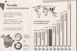
Nevada accounts for 84% of U.S. gold production today. Here’s a look at the state’s rich history, its prolific production, and what the future may hold. Read more
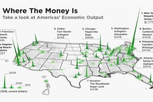
The total U.S. GDP stands at a whopping $21 trillion, but which metro areas contribute to the most in terms of economic output? Read more
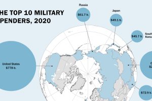
Global military spending is now at a 32-year high. We show countries’ military spending by dollars and as a portion of GDP. Read more

This infographic sizes up different rockets used to explore space, from the USSR’s Soyuz to the SpaceX Starship. Read more


