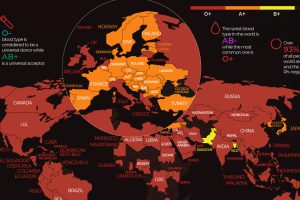
There are 8 common blood groups but 36 human blood types in total. Here we map the most widespread blood types in every country in the world. Read more
The global semiconductor shortage has affected several industries. Here’s a look at the 10 largest semiconductor companies by market share. Read more
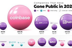
Tracking the companies that have gone public in 2021, their valuation, and how they did it. Read more
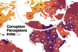
Which countries are the most (and least) corrupt? This map shows corruption around the world, and the movers and shakers over the last decade. Read more
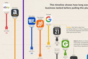
The Chinese market is notoriously difficult for foreign businesses to gain a foothold in. Here, we look at U.S. brands that tried and failed Read more
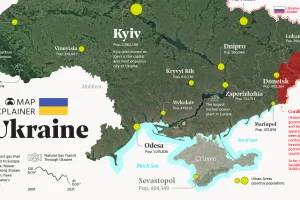
Ukraine has made the headlines due to the ongoing tensions with Russia. In this map infographic, we examine Ukraine from a structural point of view. Read more
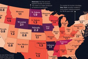
See how America’s 1.8 million truckers are distributed across the nation in these two heatmap visualizations. Read more
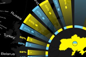
This graphic visualizes Ukraine’s top international trading partners and the country’s most exported and imported products in 2020. Read more

Explore North America’s crude oil pipelines and refineries across the U.S. and Canada in our interactive map. Read more
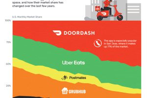
This chart shows how DoorDash and Uber Eats have come to control over 75% of the U.S. food delivery market Read more

