
Use this interactive map to explore fascinating data on international trade. Which countries trade with each other, and which are stuck as hermits? Read more
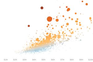
It’s no surprise that New York and San Francisco are insanely expensive, but here’s some other enclaves that have the least affordable housing in the U.S. Read more
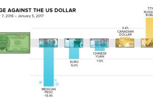
How does the Trump Effect impact currencies? Over the last two months, the peso has lost -13.4% in value, and the Russian ruble has gained 7.7%. Read more

The new president faces many pressing issues – but for many, one looms above all others: how will President Trump deal with a $20 trillion national debt? Read more
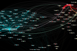
Who sends weapons to who? This data visualization represents the global weapons trade between countries, and it shines a light on two major blocs of trade. Read more
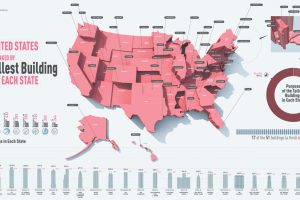
This infographic shows the tallest building in each state, ranging from the 1,776 ft tall One World Trade Center in NYC to the 124 ft Decker Towers in Vermont. Read more
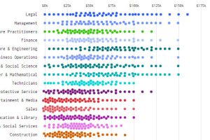
What does income distribution look like for different types of jobs – and how’s it changed over time? These charts show the drastic change from 1960 to today. Read more

What are the most expensive U.S. housing markets? This interactive 3D map looks at county-level data by price per square foot to provide an answer. Read more
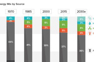
See how America’s energy mix has evolved from 1970 until today, as well as a projection for the energy sources to be used in the year 2030. Read more
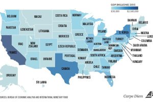
Texas is the size of Canada, and California is similar to France. Even tiny Vermont is comparable to a country’s GDP (Bahrain). Read more

