

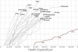
Americans spent more than $3 trillion, or 17.5% of GDP, on healthcare in 2015. Are they getting any bang for their buck? Read more
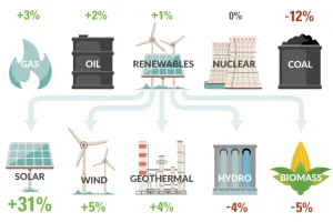
How is U.S. energy consumption shifting? This week’s chart looks at the rate of change in the use of different energy sources, including future projections. Read more

This infographic serves as a cheat sheet to the third party candidates in the U.S. Election, covering what Gary Johnson and Jill Stein are all about. Read more
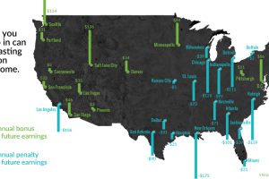
Family and neighborhoods influence a child’s development and opportunities – and as a result, future incomes. See which cities have the biggest impact. Read more
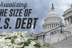
How big is $19.5 trillion, really? This infographic visualizes the U.S. national debt in comparison to other numbers that might be more familiar. Read more
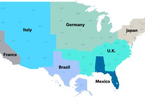
The United States has a $18 trillion economy – the biggest in the world. But here’s another way of looking at it, using three interesting maps. Read more
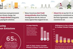
This survey of over 1,000 Americans tells you what people actually believe about fracking, coal, climate change, and other hot button energy issues in the U.S. Read more
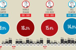
This infographic shows how the U.S. market performs in each year of a presidential term – and specifically, how the market does in election years. Read more
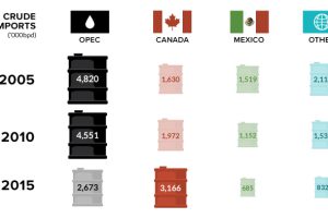
Canada is in, and OPEC is out. In this week’s chart on oil imports, we also look at the declining influence of the world’s most infamous oil cartel. Read more
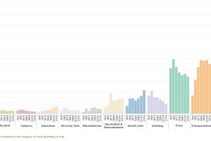
Consumers are the foundation of the economy, and how they spend money is telling. See what’s changed with how Americans spend their money over the years. Read more