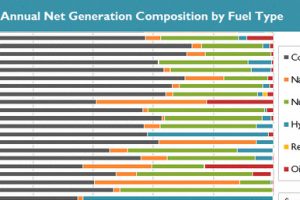
See in this .gif animation how much the U.S. electricity grid has evolved over the last two decades. Read more

This map visualizes when the household median incomes of U.S. counties reached “peak income”. For more than 80% of counties, this was over 15 years ago. Read more
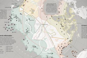
With Arctic ice thawing, the race for natural resources, shipping routes, and other territorial claims is heating up. The race for Arctic Domination is on. Read more
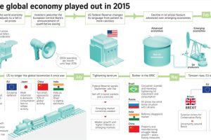
This infographic recaps economic events and sentiment in 2015. Should investors approach the new year with renewed optimism or brace for volatility? Read more
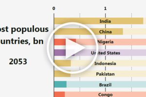
This animation shows how the ranking for the most populous countries in the world will change over more than 100 years. Read more
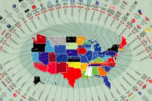
The biggest businesses in the U.S. range from oil producers to retail giants. Here’s a list showing the largest company in each state by revenue. Read more
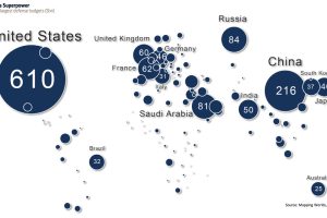
This map shows global defense spending by country – and it puts U.S. military spending into perspective. Read more

The Great Depression was the most severe economic depression ever experienced by the Western world. It was also the most famous case of deflation. Read more
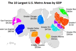
This animation uses county-level GDP data to re-size a U.S. map based on the economic contributions at a local level. Read more
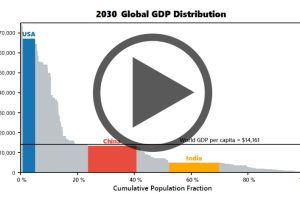
Watch the economies of the United States, China, and India evolve before your eyes from 1970 until 2030 (projected). Read more

