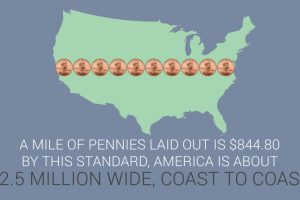
This infographic covers 33 little-known U.S. currency facts about the bills and coins in circulation today. Read more

Ever wonder how your state compares in terms of economic output? This simple visualization compares the economies of every U.S. state. Read more

In the war against ISIS, the United States is spending $9 million a day. Two-thirds of this goes to the Air Force – here’s how it breaks down by squadron. Read more

In terms of actual capacity to pay debt, the United States has the 2nd highest amount in the world. We compare debt to revenue in this data visualization. Read more
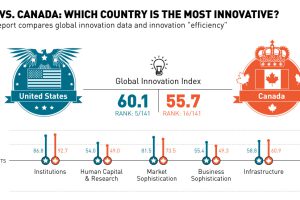
Today’s chart contrasts data from the Global Innovation Index 2015 report, to see whether it is United States or Canada that is the most innovative country. Read more
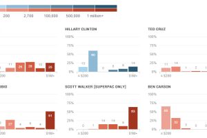
The candidates for the 2016 presidential race are employing a variety of strategies to fund their campaigns. Here’s a breakdown of funding by donation size. Read more
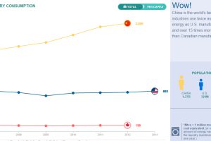
Compare the United States, China, and Canada side-by-side to see the differences in how these energy titans consume, produce, and import/export energy. Read more
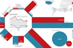
Today’s infographic looks at the economic differences between China and the United States: total reserves, GDP per capita, demographics, and much more. Read more
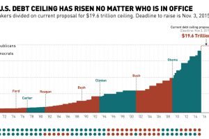
This chart shows the history of the U.S. debt ceiling from 1970 until today, including the current proposal to increase it to $19.6 trillion. Read more
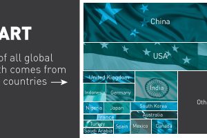
Which countries contribute the most to global economic growth? Over 80% of all growth is from 16 countries, and over half of all growth is from just two. Read more

