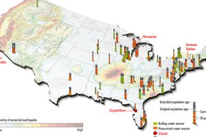
It’s no secret that China plans to build dozens of nuclear reactors in the coming years. Domestically, nuclear has taken a back seat in the United States. Read more

Today’s infographic is comparing United States and China in terms of military spending, army size, arms sales, and foreign military bases. Read more
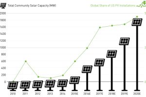
New installations of community solar farms are taking off, with cumulative capacity in the United States to increase sevenfold over the next two years. Read more
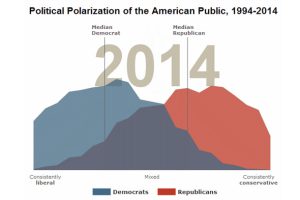
A recent study by the Pew Research Center shows that the polarization of politics in America is greater than ever before. Looking at the current presidential field only confirms this. Read more
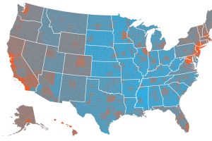
The cost of living by state and county varies significantly. Here’s how far $100 will go in every part of America. Read more
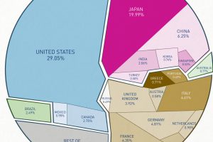
This data visualization shows total world debt by country and debt-to-GDP ratio. Read more
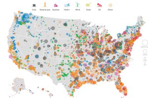
This series of data visualizations shows how the United States has generated its electricity so far in 2015 by energy source and size of each power plant. Read more
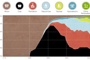
This chart shows the history of America’s energy supply based on energy source. This brief history covers all from wood-powered locomotives to solar panels. Read more
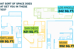
The average rent in the United States for an entry-level apartment is $769/month. Here’s what that rent gets you for square footage in different cities. Read more
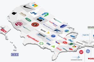
The biggest public company by market capitalization in California is Apple, and it happens to be 4000x the size of the biggest pubco in Wyoming. Read more

