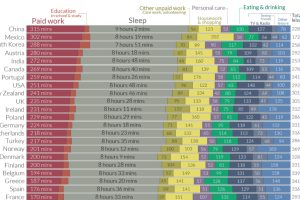
We all have the same 24 hours in the day. How do people spend them around the world, and how does this breakdown change by gender? Read more
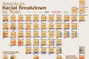
America is a cultural mosaic—nearly 40% identify as a visible minority today. Here we break down the U.S. population by race by state. Read more
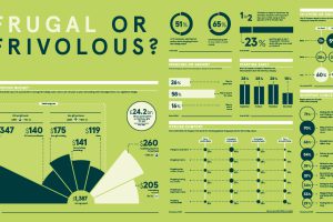
This graphic explores how festive spending in 2020 has changed as a result of the ongoing COVID-19 pandemic and evolving consumer behavior. Read more
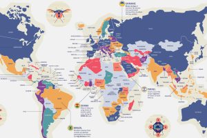
By 2025, the global commercial drone market could reach $42.8 billion. With such diverse uses, how do countries navigate drone privacy laws? Read more
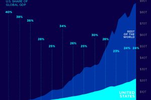
As of 2019, the U.S. made up almost a quarter of the global economy. This chart shows how the U.S. Share of the global GDP has changed over time. Read more
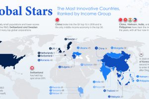
From Switzerland and China to Vietnam and Tanzania — here are the world’s most innovative countries, taking income per capita into account. Read more
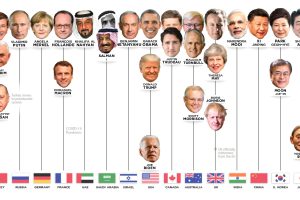
Who has led the world’s 15 most powerful countries over the last 50 years? This visual looks at world leaders from 1970 to today. Read more
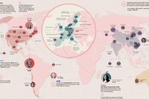
Fewer than 12% of global billionaires are women, but they still hold massive amounts of wealth. Who are the 50 richest women in the world? Read more
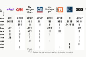
The incident at the U.S. Capitol has received wide news media coverage, but the type of language used to describe it has varied greatly depending on the publication. Read more
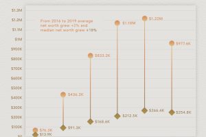
How much is the average American worth at different ages? This chart reveals the average net worth by age in the U.S. Read more

