

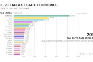
This animation shows how the largest state economies by GDP have changed over the last five decades of time, and what such a ranking looks like today. Read more
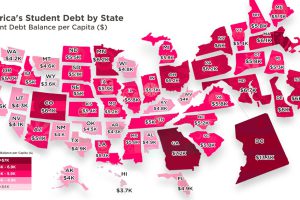
Crippling student debt in the U.S. has reached a record high of $1.5 trillion nationwide. Today’s map breaks down which states bear the highest burden. Read more
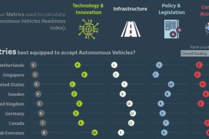
This interactive visual shows the countries best prepared for the shift to autonomous vehicles, as well as the associated societal and economic impacts. Read more
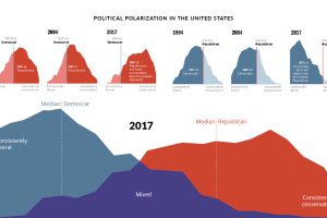
Since 1994, the political divide in the United States has only become more extreme. How have American feelings across major issues evolved over time? Read more
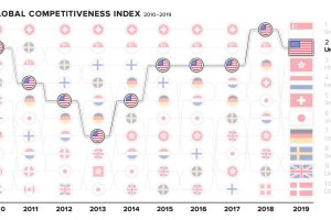
The world’s top countries excel in many fields—but there can only be one #1. How have the most competitive economies shifted in the past decade? Read more
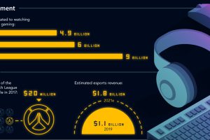
This infographic plots the journey of esports, from underground niche to a billion-dollar mainstream phenomenon—and it shows no signs of slowing down. Read more
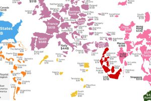
How much do your vacations contribute to your destination of choice? This visualization shows the countries that receive the most tourist spending. Read more

When breaking down the top 10 millionaire populations by country, how do they stack up against entire nations? Read more

States with long coastlines tend to host the most active duty troops, with one exception, home to the services’ newest branch. Read more
We round up the most popular, most discussed, and most liked visualizations of the month on Voronoi, our new data storytelling platform. Read more