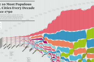
How has the list of the most populous U.S. cities changed over time? This infographic shows the top 10 cities of every decade since the year 1790. Read more

This intense animation plots data on nearly 70 years of arms sales, to compare the influence of the two superpowers from the Cold War to modern times. Read more
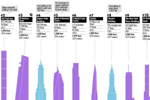
This visualization plots out the tallest buildings in New York City, as well as a few in the pipeline that will change the Big Apple’s skyline forever. Read more

Which agricultural commodity is the most important to each state’s economy? This infographic breaks it all down, based on data from the USDA. Read more
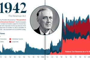
U.S. taxation has undergone massive changes over the last 250 years. From the American Revolution to modern reform, we explore its long history. Read more

More than $6 trillion of U.S. debt is owned by foreign governments such as China or Japan. See how it all breaks down, and what it means. Read more
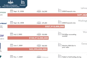
There is always risk in business – but for these 20 companies, which caused the biggest bankruptcies in history, those risks didn’t quite pan out. Read more

This interesting diagram breaks down all U.S. energy use by both source and industry, and everything that happens in between. Read more

This stunning set of 3d maps purposefully exaggerate the elevation scale to show you the mountains of both the United States and North America. Read more
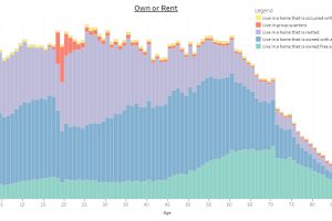
This interactive infographic allows you sort data on the U.S. population using a variety of topics, to see how Americans differ by age. Read more

