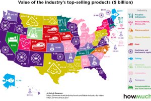
Which industries reign supreme in the United States? This map breaks down the most profitable industry, state by state. Read more
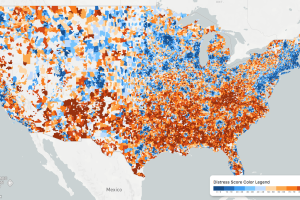
While the U.S. economic picture remains quite rosy, things change quickly when you zoom to the local level. This map shows the country’s distressed communities. Read more
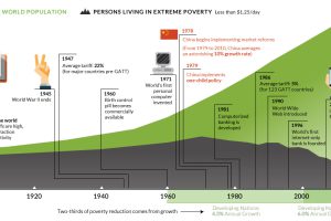
This interactive graphic shows the poverty rate of every state, and also how poverty levels have changed over time according to the U.S. Census Bureau. Read more
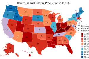
In countries where energy is plentiful, we often take the grid for granted. But do you know where your power comes from, and how green it is? Read more
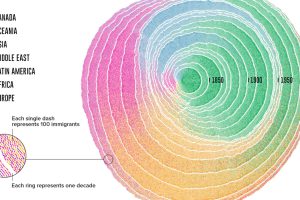
Since 1830, there have been four major waves of U.S. immigration – and this unique video depicts the influx of immigrants as rings in a tree trunk. Read more
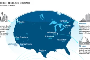
Silicon Valley is no longer the only place to be for a career in tech. Here are the fastest growing tech markets across North America, and the up-and-comers. Read more
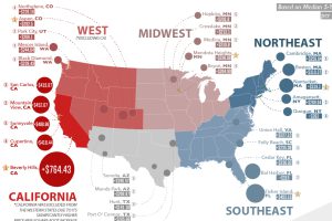
Here are the biggest increases in median housing prices (per sq. ft) over the last 5 years. See where real estate prices are rising (and falling) the fastest. Read more
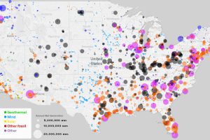
What sources of power are closest to you, and how has this mix changed over the last 10 years? See every power plant in the U.S. on this handy map. Read more

This animation shows the population density of U.S. counties between 1790 and 2010, showing the westward expansion of the country’s population. Read more
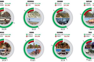
This infographic uses the measure of median household income to contrast the wealthiest and poorest counties in every U.S. state. Read more

