

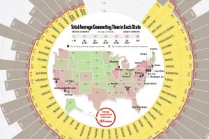
This infographic compares all U.S. states by average commute time, while also listing the top 10 cities with the longest and shortest commutes in the country. Read more
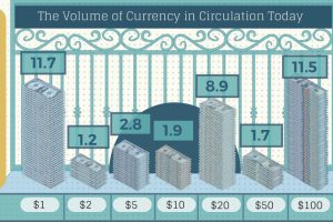
How many U.S. dollar bills exist, and how long does each type of note last? This infographic breaks down the world of physical U.S. currency. Read more

The legal cannabis industry is coming out of the dark. Here are 9 things investors should know about this rapidly changing and growing sector. Read more
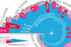
Which state could be hit hardest by a trade war? Here is every U.S. state organized by total economy size, and the share tied to international trade. Read more
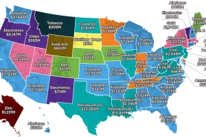
Largest state exports range from common goods, like autos, planes, and oil, to far more peculiar goods like distillery dregs, lobsters, and soda ash. Read more
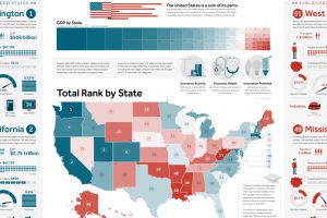
This giant infographic has state economies ranked from best to worst, based on an overall score comprised of 27 different metrics. Read more

This interactive map uses 114 metrics to measure the geopolitical power and influence of 25 countries, focusing on Asian powers and the United States. Read more

How is the country’s energy generated, and how is it consumed? This nifty Sankey diagram shows U.S. energy consumption in a simple and understandable way. Read more

The U.S. is known as a nation of immigrants – but just who came to America, and why? This striking animation tells the story. Read more

Aluminum and steel are two metals at the center of the current trade debate. This infographic provides context on the history of the metals in North America. Read more