

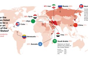
Using two different polls and glancing through 15 years of data, we see who Americans consider to be their #1 enemy – as well as how it has changed over… Read more
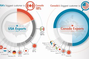
Key facts and numbers behind the historic USA-Canada trade relationship, in which a staggering $1.7B in goods are exchanged per day. Read more
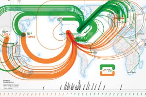
Ever wonder who holds U.S. debt abroad? This infographic shows foreign holders of U.S. treasuries, as well as the debt from other countries held by U.S. Read more

American whiskey is experiencing an impressive resurgence, but the road to the current bourbon boom hasn’t always been smooth. Read more
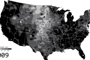
See the ebbs and flows of regional unemployment in the United States in this animated map from 1990 until 2016. Read more
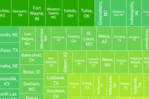
With rental prices rising sharply across the U.S., these interactive graphics show the trade-off between the cost and size in the 100 largest metro areas. Read more

Millions, billions, trillions – these are abstract numbers. Here’s what $20 trillion of U.S. debt looks like in terms of cold hard cash. Read more

Many U.S. inventions, such as the internet or airplane, have had a profound impact on the world. Here’s each state’s most important invention. Read more
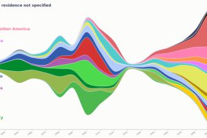
This series of maps and visualizations shows immigration in America starting in 1820. We also look at who identifies as having American ancestry today. Read more
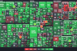
The U.S. market is up 9.5% so far in 2017, but individual sectors are all over the place. We look at four of the best – and four that have… Read more