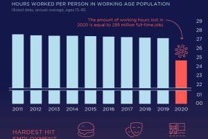
The pandemic has impacted employment greatly. This visual reveals how its effects have led to losses in hours worked by global workers in 2020. Read more
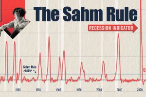
The Sahm Rule was triggered in July, but it may be overstating U.S. recession risk due to today’s unique job market dynamics. Read more
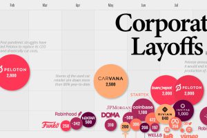
This infographic highlights the accelerating pace of layoffs so far in 2022, as businesses cut costs ahead of a potential recession. Read more
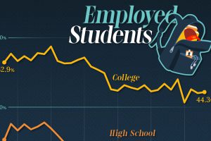
This graphic shows U.S. high school and college student employment from 1993 to 2023, based on data from the U.S. Bureau of Labor Statistics. Read more
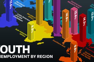
While the global youth unemployment rate dropped to a 15-year low, there were significant differences by region. Which countries had the highest rate? Read more
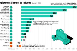
The U.S. labor market is remarkably strong, with a 3.4% unemployment rate. Which sectors are seeing the highest job gains in 2023? Read more
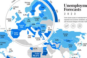
Unemployment is forecast to tick higher in 2023, but so far red-hot labor markets are resisting this trend on a global scale. Read more
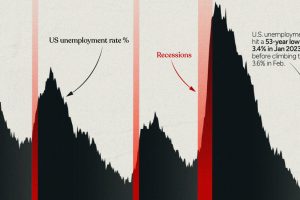
This infographic examines 50 years of data to highlight a clear visual trend: recessions are preceded by a cyclical low in unemployment. Read more
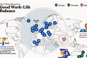
In this infographic, we explore which cities around the world excel in prioritizing work–life balance. Read more


