

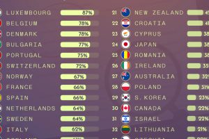
Ranking countries and their unemployment benefits, measured by the percentage of previous employed income received after a year out of work. Read more
This lengthy infographic counts down the 10 most miserable countries in the world based on key economic factors such as inflation, growth, and unemployment. Read more
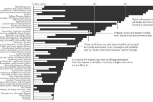
What types of jobs will be lost to automation? This data visualization applies probabilities from a well-cited study to current U.S. job numbers. Read more
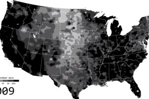
See the ebbs and flows of regional unemployment in the United States in this animated map from 1990 until 2016. Read more
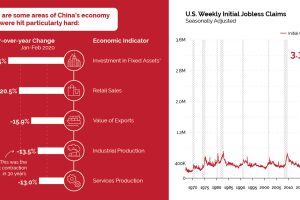
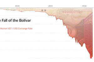
China has seen a severe economic impact from COVID-19, and it may be a preview of what’s to come for countries in the early stages of the outbreak. Read more
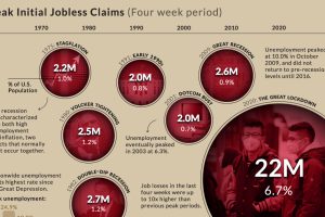
In the last four weeks, 22 million Americans filed initial jobless claims. Here’s how that staggering number compares to the peaks of past recessions. Read more
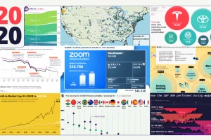
These 20 charts, maps, and visualizations help capture what happened in a tumultuous year around the globe. Read more
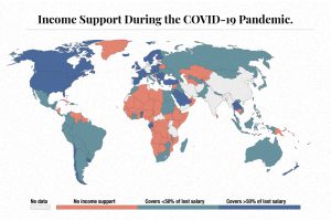
The need for income support during COVID-19 has been vast. This map visualizes different levels of income support around the world. Read more
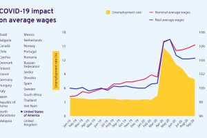
The pandemic has impacted labor in many ways. Here’s how global wages and unemployment have been affected by COVID-19 in 30 countries. Read more
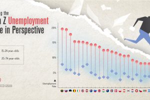
COVID-19 has impacted everyone, but one generation is taking it harder than the others. This graphic reveals the Gen Z unemployment rate. Read more