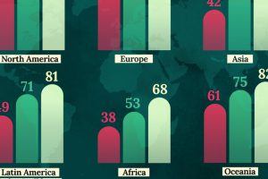
This map shows life expectancy at birth for key global regions, from 1950 to 2050F. Read more
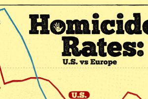
The UK homicide rate is about one-sixth of the rate in the U.S. Read more
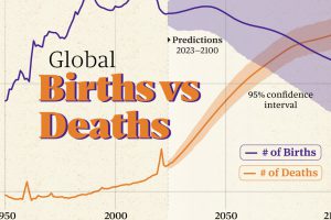
A global population inflection point is closer than we think. The latest UN estimates say 2084 could be a crucial year. Read more
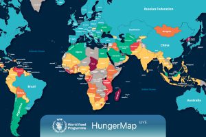
Every day, hunger affects more than 700 million people. This live map from the UN highlights where hunger is hitting hardest around the world. Read more
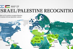
In this visualization, we look at how international recognition of Israel and Palestine breaks down among the 193 UN member states. Read more
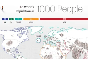
How would all the people in the world be spread out if there were only 1,000 people on Earth? This interactive map examines the breakdown. Read more
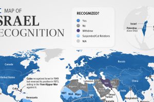
Belize is the latest country to suspend relations with Israel as of November. In this graphic we map the recognition of Israel by country. Read more
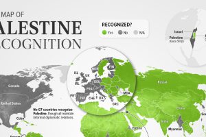
As of November 2023, 138 of the 193 UN members recognized Palestine. This map shows the recognition of the State of Palestine by country. Read more

Which countries trust the United Nations to do the right thing the most, and the least? Read more

