

Examining how people get around using cars, public transit, and walking or biking, and the regional differences in usage. Read more
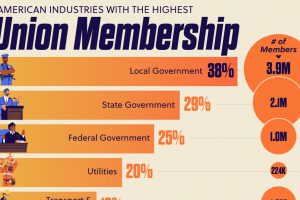
One in four federal government workers have a union membership. State and local governments rates are even higher. Read more
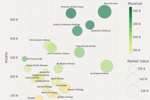
Comparing the largest public-traded airline companies in the world, based on revenue, profit, assets, and market capitalization. Read more
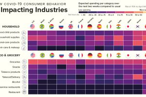
This infographic showcases the industries that will benefit from COVID-19 consumer spending, and the industries that have a very uncertain future. Read more
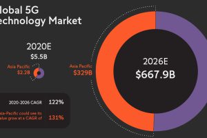
With the imminent 5G revolution, total connectivity could be at our fingertips. This graphic looks at its far-reaching IoT applications and potential. Read more
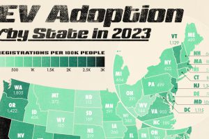
This graphic displays the number of registered electric vehicles (EVs) per 100,000 people in each state as of June 2024. Read more
What’s the lowest-carbon way to travel? Here’s how much CO2 different types of vehicles emit per passenger-kilometer. Read more
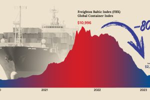
After a dramatic spike during the pandemic, shipping costs have now fallen back to Earth. What does that mean for shippers and the economy? Read more
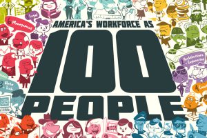
Reimagining all 200 million of the American workforce as 100 people: where do they all work, what positions they hold, and what jobs they do? Read more