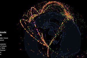
Use this interactive map to explore fascinating data on international trade. Which countries trade with each other, and which are stuck as hermits? Read more
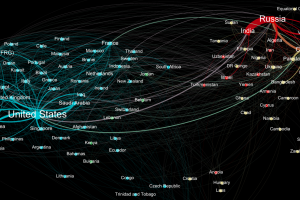
Who sends weapons to who? This data visualization represents the global weapons trade between countries, and it shines a light on two major blocs of trade. Read more
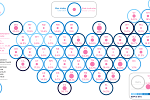
With the risk of a trade war heating up, here are the U.S. states that rely the most on foreign trade as a percentage of GDP. Read more
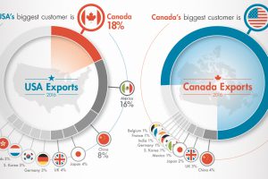
Key facts and numbers behind the historic USA-Canada trade relationship, in which a staggering $1.7B in goods are exchanged per day. Read more
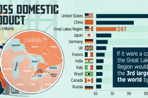
We don’t think of the Great Lakes as its own economy, but maybe we should. It’s tightly integrated by trade, and generates $6 trillion in GDP each year. Read more
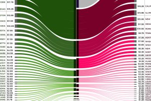
Canada is the largest international trade partner for most U.S. states – use this visualization to see how connected every state is to neighbors to the north. Read more
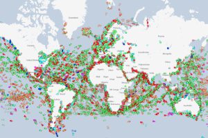
We show you a website that tracks every ship in real-time, and use it to highlight the world’s oil chokepoints, the coast of Somalia, and other observations. Read more
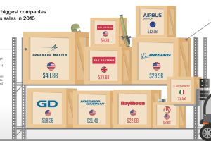
Want a fighter jet or a new tank? These ten companies – most of them based on the U.S. – are the firms that sell the most weapons in the… Read more
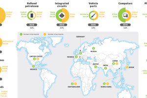
What are the most traded goods in the world? This map shows the 18 top goods, as well as the biggest importer and exporter of each good. Read more
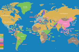
Whether your country’s top export is crude oil or flavored water, it’s all on this massive map that shows the most important export for every economy. Read more

