
The 20 nations featured in this graphic each owe billions in debt to China, posing concerns for their economic future. Read more
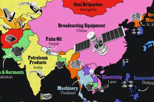
Asia’s exports span a wide range, from petroleum to technology components and textile products. Read more
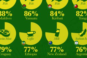
Which countries are most heavily dependent on agricultural exports to fuel their economies? We visualize the data in this chart. Read more
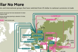
Recent trade deals and the creation of the Asian Infrastructure Investment Bank show the dollar is slowly losing its status as the primary reserve currency. Read more
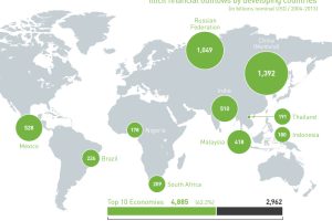
In the last decade, over $7.8 trillion of illicit financial outflows have come out of developing countries. We follow the world’s “hot” money in this chart. Read more
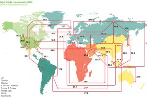
Every day, 93 million barrels of oil are consumed by the global economy. How does this oil change hands? This map visualizes the global oil trade. Read more
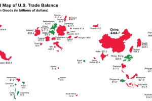
The U.S. has run a trade deficit for 40 years now. Where does that net foreign spending go? This map visualizes the data from 2015. Read more
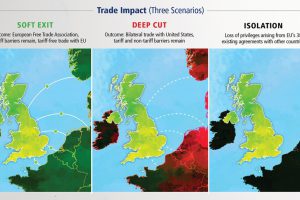
A potential British exit from the European Union, or Brexit, could have big ramifications for investors. Here’s the view from one think tank why a Brexit would be a losing… Read more
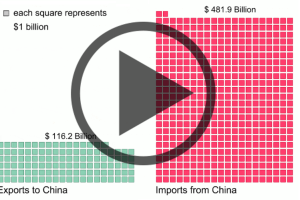
Donald Trump claims that the U.S. keeps losing to China in trade. His numbers are technically untrue, but they’re not far off. Read more
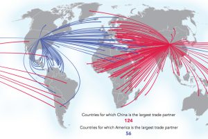
These four maps tell the story of Chinese trade dominance and ambitions. See how Beijing’s sphere of influence is rapidly changing. Read more

