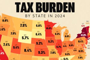
Tax burden measures the percent of an individual’s income that is paid towards taxes. See where it’s the highest by state in this graphic. Read more

A survey during peak tax filing season reveals two big complaints that Americans have with the federal tax system. Read more
We round up the most popular, most discussed, and most liked visualizations of the month on Voronoi, our new data storytelling platform. Read more
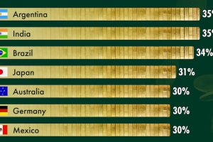
Interestingly, BRICS members cover the spectrum of corporate tax rates in the G20 from highest (India, Brazil) to lowest (Russia). Read more
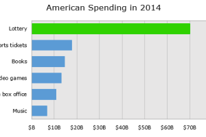
Breaking down the economics of the lottery, we show how the lottery ends up being an excise tax on some of the poorest people in the country. Read more
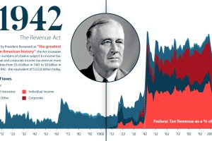
U.S. taxation has undergone massive changes over the last 250 years. From the American Revolution to modern reform, we explore its long history. Read more
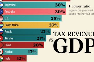
Measuring the ratio of tax revenue to economic size reveals the government’s ability to spend on public services. Read more
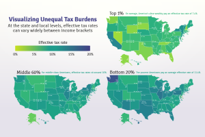
Poor families pay a higher share of their income towards state and local taxes than wealthy families. These maps show the inequitable tax burdens. Read more
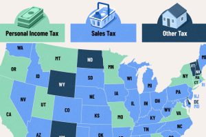
A vast majority raise the most through general and selective sales taxes. Here’s the single largest source of tax revenue for all 50 states. Read more
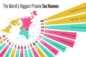
What countries or territories do the ultra-wealthy use as tax havens? Read more

