

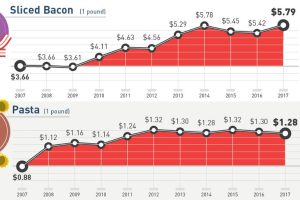
How much more expensive are basic staples than they were 10 years ago? This infographic tracks grocery prices for 30 common items like cheese, fruit, and eggs. Read more
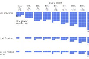
Visualizing how different income groups spend their money on things like housing, food, transportation, health, and travel. Read more
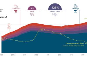
How are American household finances shifting in terms of income, savings, debt, and spending? This series of charts shows the trends you need to know. Read more
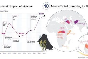
Aside from the obvious human toll, violence also hurts productivity and wealth creation. We visualize the real economic impact of violence in these charts. Read more
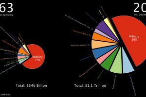
This stunning one minute animation breaks down U.S. government discretionary spending from 1963 all the way until today. Read more

An additional $2.1 trillion of spending will be needed to get America’s infrastructure back on track – here’s how that creates an opportunity for investors. Read more
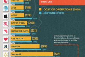
Running a Fortune 500 company is a costly endeavor. In this chart, we compare the operating costs of America’s biggest names. Read more

Gen Z is expected to add almost $9 trillion in spending globally in the next 10 years, more than any other generation. Read more