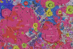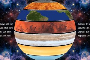
Rotation can have a big influence on a planet’s habitability. These animations show how each planet in the solar system moves to its own distinct rhythm. Read more

Our solar system is a surprisingly crowded place. This incredible map shows the 18,000 asteroids, comets, planets and moons orbiting the Sun. Read more
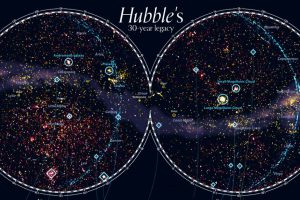
For 30 years, the Hubble Space telescope has been our eye into outer space. This stunning map looks at 550,000 observations made between 1990-2019. Read more
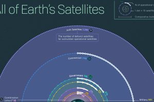
Nearly 6,000 satellites circle our tiny planet. About 60% are space junk, 40% are operational—and hundreds more are launched every year. Read more
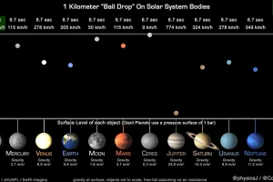
This unique animation, created by a planetary astronomer, compares and highlights the gravitational pull of the planets. Read more
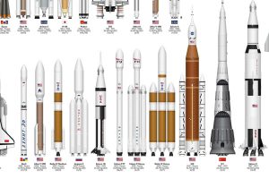
This infographic sizes up different rockets used to explore space, from the USSR’s Soyuz to the SpaceX Starship. Read more
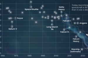
How much does a space flight cost? Here’s a look at the cost per kilogram for space launches across the globe since 1960. Read more
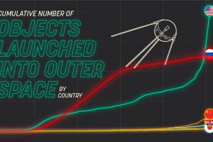
Which countries dominate outer space? This visual displays the number of objects every country has launched into space over time. Read more
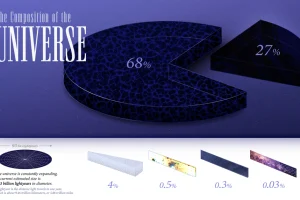
We explore the ultimate frontier: the composition of the entire known universe, some of which are still being investigated today. Read more


