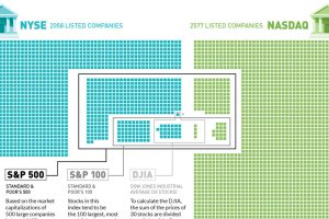
Plotting the 4,500+ companies on the NYSE and NASDAQ to show how the S&P 500, S&P 100, and Dow are derived. Read more
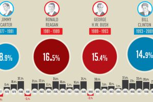
This infographic shows how the U.S. market performs in each year of a presidential term – and specifically, how the market does in election years. Read more
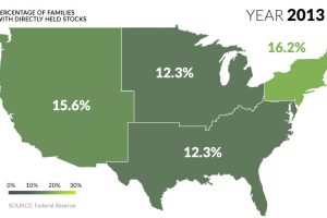
U.S. markets continue to hit all-time highs, but what percentage of population actually benefits? See stock ownership across the U.S. on this animated map. Read more
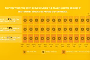
Here’s how ‘circuit breakers’ in the stock market work, and how these pauses are supposed to prevent the next market crash from happening. Read more
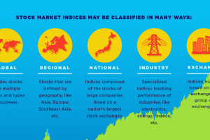
This infographic helps to explain the basics around what a stock market index is, and what it does. Read more
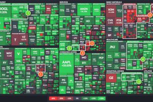
The U.S. market is up 9.5% so far in 2017, but individual sectors are all over the place. We look at four of the best – and four that have… Read more

This graphic lists the largest sector ETFs by AUM in 11 major stock sectors, including technology, energy, and healthcare. Read more
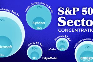
Among all sectors, Amazon makes up the greatest share of their sector, accounting for 39% of the Consumer Discretionary sector. Read more

This map shows the number of Fortune 500 companies headquartered in each state. Which states have the highest concentration of large firms? Read more


