

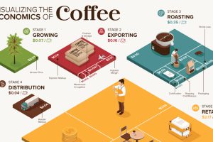
What makes your cup of coffee possible, and how much does it really cost? Here’s how the $200B coffee supply chain breaks down economically. Read more
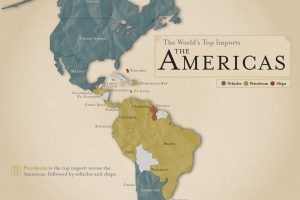
What are the most popular imports across the Americas? Petroleum is number one, followed by vehicles and ships. Read more
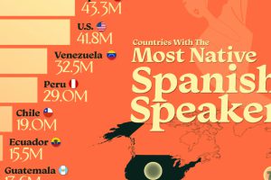
Spain’s previous colonial expansion means there are now three countries with more native Spanish speakers than Spain. Read more
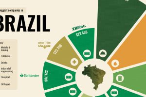
What drives some of the world’s emerging economies? From natural resources to giant banks, here are the top 10 biggest companies in Brazil. Read more
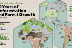
Where are the world’s forests still shrinking, and where are they seeing net gains? We map deforestation by country between 1990-2020. Read more
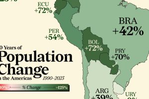
Nearly every country in the Americas has seen a population boom in the last three decades. Some have doubled in size. Read more
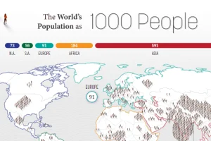
How would all the people in the world be spread out if there were only 1,000 people on Earth? This interactive map examines the breakdown. Read more
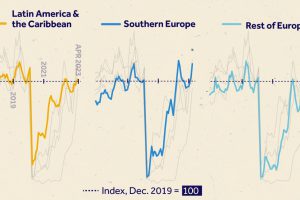
We visualize monthly foreign visitor arrivals, indexed to December 2019, indicating global tourism has all but recovered from COVID-19 disruptions. Read more
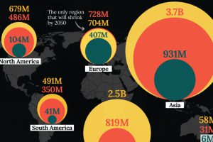
In this visualization, we map the populations of major regions at three different points in time: 1900, 2000, and 2050 (forecasted). Read more
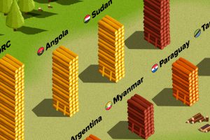
The country with the most forest loss since 2001 lost as much forest cover as the next four countries combined. Read more