

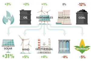
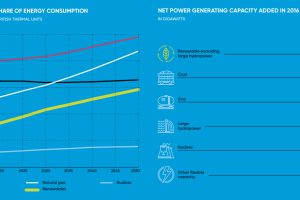
How is U.S. energy consumption shifting? This week’s chart looks at the rate of change in the use of different energy sources, including future projections. Read more
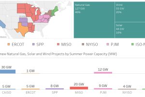
Nearly 100 GW of new power coming online is from solar and wind, making up 36% of new electrical capacity being added in these jurisdictions. Read more

This infographic shows the many technological advances made throughout the history of solar energy – going all the way back to the Neolithic Era in China. Read more
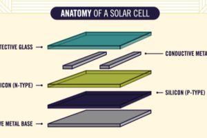
Ever wonder how solar panels work to generate electricity? This animated infographic explains the science behind it, making it easy to understand for anyone. Read more
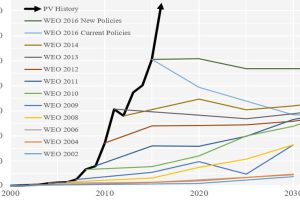
Forecasting the future of energy is not an easy task. These charts show how the experts have fared at forecasting solar over recent decades. Read more
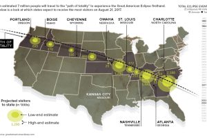
The Great American Eclipse will stretch over 12 states, and it’s being called the greatest temporary mass migration to see a natural event in U.S. history. Read more
In 2016, more net capacity was added for clean energy than all other types combined. Who’s adding renewable capacity, and how much are they investing? Read more
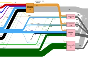
How is the country’s energy generated, and how is it consumed? This nifty Sankey diagram shows U.S. energy consumption in a simple and understandable way. Read more

Renewable energy is set to fuel a new era of copper demand – here’s how much copper is used in green applications from EVs to photovoltaics. Read more
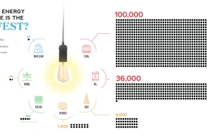
The empirical data on which energy source has led to the fewest human deaths may not be the one you expect. Read more