


This map shows how many energy projects are in interconnection queues by state and how long these projects have been queued up, on average. Read more
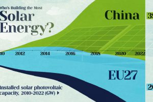
China’s solar capacity triples USA, nearly doubles EU. Read more

Explaining recent advances in renewable energy such as organic solar cells and concentrated solar. Read more

In this Powering New York slideshow, we visualize what it takes to power NYC with every type of energy including gas, wind, solar, nuclear, and more. Read more
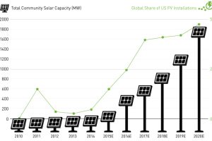
New installations of community solar farms are taking off, with cumulative capacity in the United States to increase sevenfold over the next two years. Read more

This series of data visualizations shows how the United States has generated its electricity so far in 2015 by energy source and size of each power plant. Read more
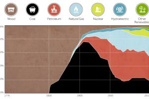
This chart shows the history of America’s energy supply based on energy source. This brief history covers all from wood-powered locomotives to solar panels. Read more
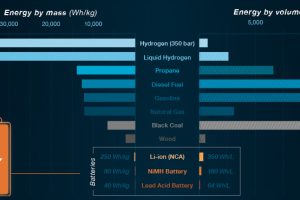
In Part 2 of the Battery Series, we show what batteries can and cannot do with today’s technology. We also look at the ideal properties of a battery. Read more

This infographic highlights the top 10 emerging technologies that are finally ready for prime time in 2016. Read more
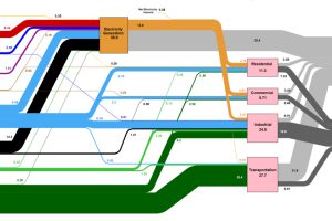
This massive diagram shows all energy created in the U.S., and where it goes. It’s not sexy, but it gives a great 10,000 ft overview of energy consumption. Read more