Home
silver
silver
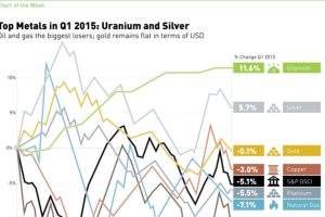
In 2015 Q1, silver and uranium led the way, while oil and natural gas struggled. See all returns in today’s Chart of the Week. Read more

In Part 3 of the Silver Series, we cover the world’s growing demand for silver. One of the most versatile metals, demand for silver stems from industry, investment, and jewelry. Read more

In the finale of our four part infographic series of silver, we look at the case for holding silver as an asset. Read more
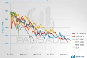
These five charts show why gold stocks have never been cheaper. Read more
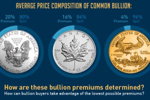
The price that investors pay for gold or silver bullion depends on two things: spot price and bullion premiums. How are the premiums calculated? Read more
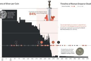
This data visualization plots the causes of death of Roman Emperors against the content of silver coins. Read more
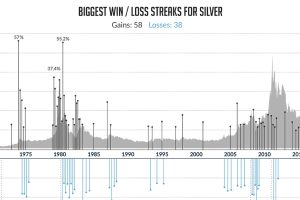
When silver wins, it wins big. Here’s silver’s biggest winning streaks (over 10% gains) as well as its worst losing streaks. Read more
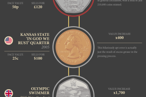
This infographic provides an introduction to rare coins, including some of the bizarre stories behind coins that are highly sought-after by collectors. Read more
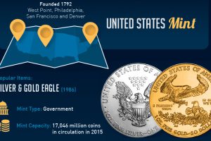
In precious metals, trust is paramount. If you own silver or gold, there’s a good chance that it comes from one of the world’s most reputable and popular mints. Read more

Most currency buffs know of silver’s monetary uses through history – but this infographic goes another direction. Here are 21 other amazing uses for silver. Read more

