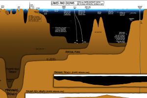
A unique and entertaining graphic that compares the depth of the world’s lakes and oceans, as well as the deepest holes ever drilled. Read more
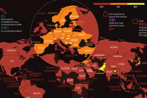
There are 8 common blood groups but 36 human blood types in total. Here we map the most widespread blood types in every country in the world. Read more
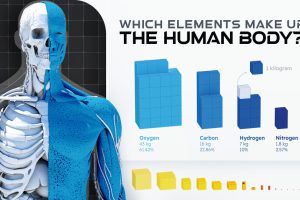
Of the 118 chemical elements found on Earth, only 21 make up the human body. Here we break down the elemental composition of the average human. Read more
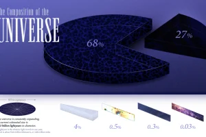
We explore the ultimate frontier: the composition of the entire known universe, some of which are still being investigated today. Read more
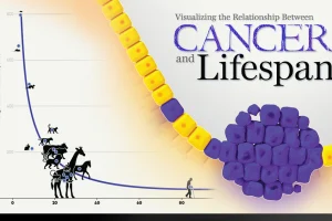
New research links mutation rates and lifespan. We visualize the data supporting this new framework for understanding cancer. Read more
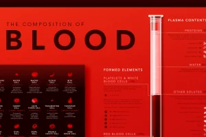
Despite its simple appearance, blood is made up of many microscopic elements. This infographic visualizes the composition of blood. Read more
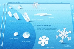
Snowflakes are ice crystals that are beautifully diverse and mysteriously symmetrical. We show what controls their intricate designs. Read more
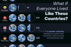
How many Earths would we need if the global population lived like Americans? This infographic answers this question and more. Read more
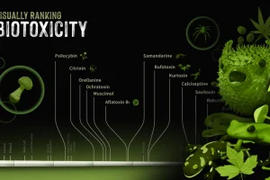
The world can be a poisonous place. We look at a number of different biotoxins found in the natural world and rank their toxicity. Read more


