

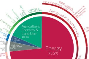
World emissions have reached almost 50 billion tonnes of greenhouse gases (GHGs) and counting. Which major sectors do they originate from? Read more
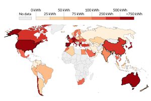
This visualization highlights the growth in solar energy consumption per capita over 54 years. Which countries are leading the way? Read more

Bitcoin mining requires significant amounts of energy, but what does this consumption look like when compared to countries and companies? Read more

Out of all energy sources, nuclear energy has the smallest partisan gap between Democrats and Republicans. Read more
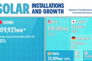
The Asia-Pacific region is leading the solar energy transition as of 2023. Which countries are building the most solar power? Read more
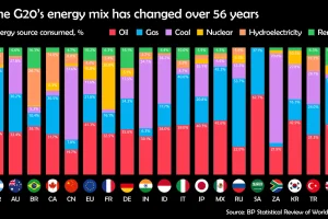
Watch how the energy mix of G20 countries has evolved over the last 50+ years. Read more
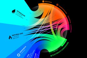
From renewables to fossil fuels, we’ve visualized the diverse mix of energy sources that powered U.S. energy consumption in 2020. Read more
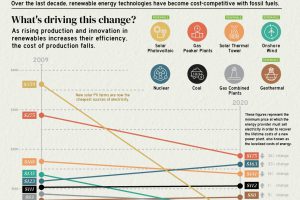
The cost of electricity from solar PV plants has decreased by 90% since 2009, highlighting the rapidly changing economics of electricity production. Read more
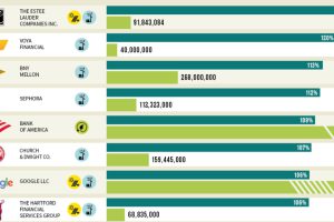
Which U.S. companies use the most green energy as a percentage of total energy used? Here are the 50 highest ranked companies according to the EPA. Read more
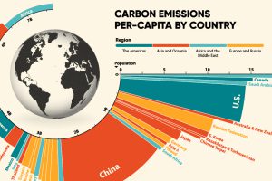
33.6 Gt of CO2 was emitted across the world in 2019. Here we visualize the global per capita CO2 emissions by country and region. Read more